
Author: admin
-

Terminal Affection
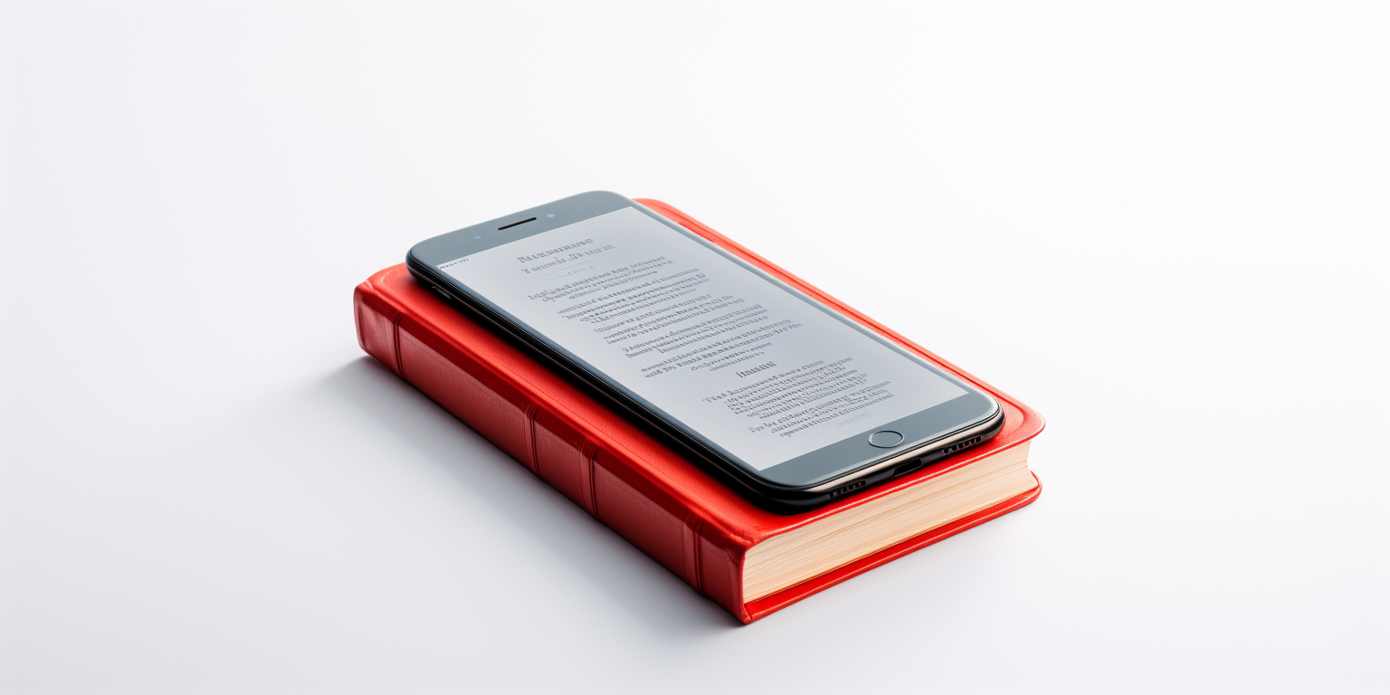
This content is available only for smartphones.
002Terminal Affection
Short story by Claudio Beck
Story Book / Adult / Fiction
Dr. Jonathan Turner was a brilliant and compassionate physician known for his unwavering dedication to his patients. His life had always been defined by the principles of medicine, until the day Emily, a beautiful young woman with a terminal condition, walked into his clinic. Her diagnosis was grim – only weeks left to live.
As Jonathan examined Emily’s medical records and listened to her hopes and dreams, he couldn’t help but feel a deep connection with her. Emily’s spirit shone brightly despite her dire prognosis, and her resilience in the face of death touched something deep within the doctor’s heart.
Their encounters extended beyond the confines of the clinic. Jonathan found himself drawn to Emily’s zest for life, her laughter like a balm for his own weary soul. Emily, in turn, found solace in Jonathan’s presence, a kindred spirit who understood the fragility of existence.
As weeks turned into days and Emily’s condition deteriorated, their bond deepened into an intense and passionate love. They shared stolen moments, savoring the time they had left together, knowing it was borrowed from an unforgiving fate.
However, just as their love seemed to defy the constraints of time, a twist of fate struck. Jonathan discovered a new and experimental treatment that could potentially save Emily’s life. It was a ray of hope in the darkest of circumstances, a chance to rewrite their story and create a future together.
Yet, the treatment came with risks. There were no guarantees, and Emily’s frail condition made her a high-risk candidate.
Jonathan faced an agonizing dilemma: should he risk her life for a chance at a future together, or should he honor her original prognosis and allow her to live her remaining days in peace?
Unexpectedly, Emily made the decision for him.
She chose not to pursue the treatment, recognizing that the love they had shared in their final weeks was more meaningful than any uncertain future.
Her courage in the face of death inspired Jonathan, and he stood by her side as she embraced her last moments with grace and dignity.
As Emily peacefully passed away in Jonathan’s arms, he realized that true love wasn’t measured by the length of time one had together, but by the depth of the connection they shared. Her memory would forever be etched in his heart, a reminder of the profound impact love could have, even in the face of the most challenging circumstances. And so, he continued to practice medicine, carrying the memory of Emily and their extraordinary love with him, forever transformed by their brief but the deepest connection.
This fictional story was brought to you by Claudio Beck through prompting using OpenAI ChatGPT and illustrations prompted by Midjourney.
Copyrighted content. Do not sell.This content is free to share. Share it if you liked.
Disable ad-blocker to see sharing buttons.
-

Stolen Whispers
This content is available only for smartphones.
001Stolen whispers
Short story by Claudio Beck
Story Book / Adult / Fiction
In the dimly lit alleyways of a nameless city, cloaked in the heavy shroud of dusk, there existed a girl whose obsession with theft surpassed mere kleptomania. It was her religion.
They called her Isolde, though no one knew if that was her true name, for she had also stolen her own identity long ago. Her eyes, as dark as the moonless night, betrayed neither remorse nor conscience. Her audacity in each and any move glittered like stolen jewels.
Isolde was a maestro of subterfuge, filching secrets from the pockets of the unsuspecting, leaving behind trails of bewilderment. Her nimble fingers, guided by an insatiable thirst for the forbidden, danced like a shadow in the dark corners of society.
She pilfered not for riches but for the thrill, for the intoxication of stealing someone’s very essence.
Her life was just like that since forever.
One fateful evening, while shadowing a mysterious man with an enigmatic aura, Isolde found herself drawn to a peculiar antique shop. Its dusty windows revealed an array of arcane curiosities, each whispering secrets from forgotten realms. She was lured inside, her heart pounding in anticipation of the next daring conquest.
Within the shop, Isolde’s eyes fell upon an intricately carved obsidian amulet—a relic said to hold the power to unlock the deepest mysteries of the human soul. The temptation was irresistible, and in a moment of audacious impulse, she snatched it and vanished into the labyrinthine streets.
Unbeknownst to Isolde, the amulet was no ordinary treasure. As she held it close, its dark energy began to seep into her very being. First the veins felt tight as sharp needles pinching the whole body. It unveiled the hidden turmoil within her soul, and for the first time, Isolde felt the weight of her sins.
She was facing her own dark image within an unknown realm that she could not escape nor resist.
Tormented by the stolen secrets that haunted her dreams, Isolde embarked on a journey of redemption. That was unfamiliar to her. After some hours stuck inside this cosmic feeling, she returned to the antique shop, the amulet in hand, tears glistening in her eyes. The enigmatic shopkeeper, who had known all along, welcomed her with a knowing smile.
In an exchange of whispered words and silent confessions, Isolde returned the stolen amulet, releasing the captive secrets within. The amulet fainted its shine but a newfound clarity washed over her, as if a dark fog had lifted from her soul.
Isolde’s life of theft came to an end that day, but she found something far more valuable than stolen trinkets. The salvation of her own conscience was her most prized treasure.
She left behind all shadows of her past, a reformed sinner, forever changed by the enigmatic power of the obsidian amulet and the wisdom it had unlocked within her.
In the labyrinthine alleys of that nameless city, the legend of Isolde, a convicted cleptomaniac, would be whispered for generations as a testament to the power of redemption found in the unlikeliest of places.
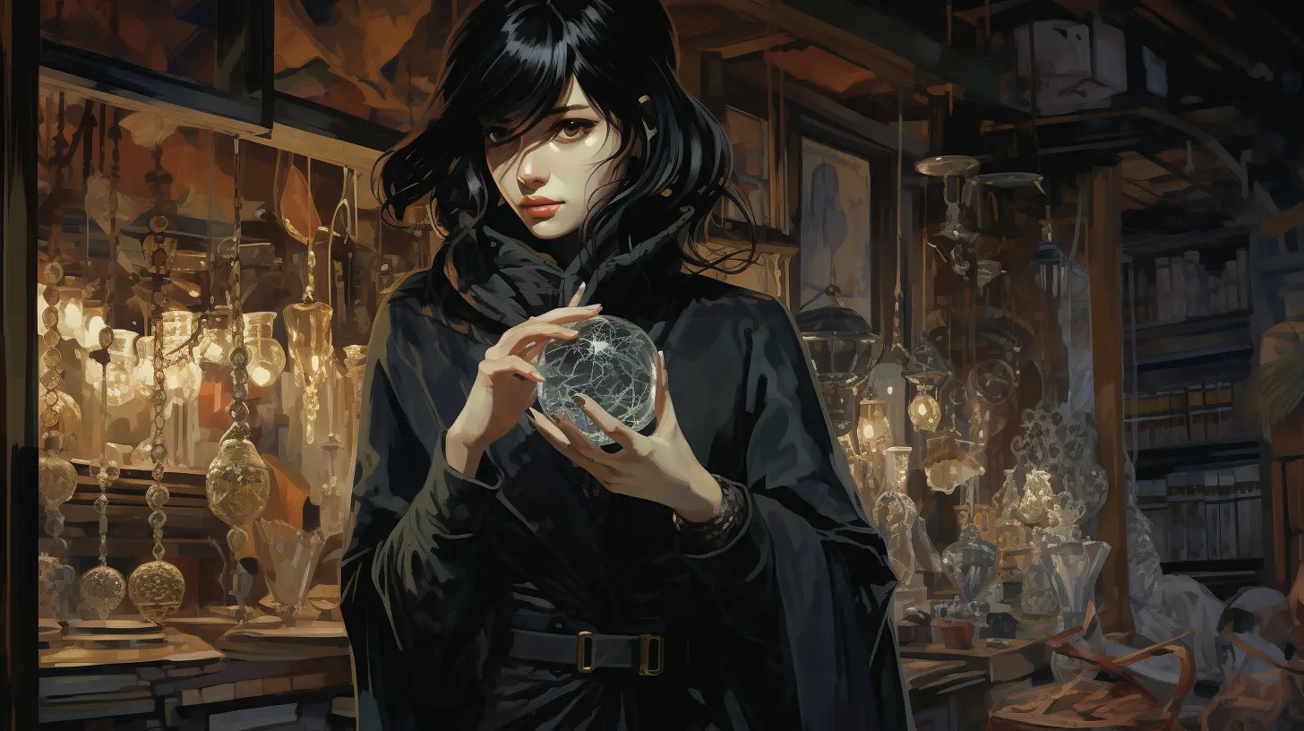
This fictional story was brought to you by Claudio Beck through prompting using OpenAI ChatGPT and illustrations prompted by Midjourney.
Copyrighted content. Do not sell.This content is free to share. Share it if you liked.
Disable ad-blocker to see sharing buttons.
-

Portfolio Graphic Design
Graphic Design
grafikdesign / graphiste / design gráficoAs graphic designer, I create visual concepts, using computer software or by hand, to communicate ideas that inspire, inform, or captivate consumers. I develop the overall layout and production design for various applications such as advertisements, brochures, magazines, and corporate reports.
My skills in typography, composition, color theory, and the ability to work within branding guidelines are some of my strongest points. I am able to effectively communicate with clients and understand their needs to produce visual assets and identities that meet their objectives and resonate with their target audience.
visual identity and icon design
Aarberg 800 Jahre JubiläumComplete takeover of visual identity for Aarberg in this festive logotype to celebrate the 800th municipality anniversary. The history come along from medieval times to today´s flat colors and lines. the minimal approach I took is everything we want to see on a contemporary icon design.
LOGO DESIGN AND BRAND IDENTITY
The process I use to create a high-quality logo and brand identity for a company follows a structured and thorough process that typically includes these steps:
Research and Analysis: In order to research the company, its target audience, competitors, and industry to gain a comprehensive understanding of your brand, I fully immerse in your daily routine and breathe your culture and corporate philosophy.
Concept Development: Based on the research, I create a concept design that visually expresses the brand’s values, mission, and goals.
Refinement and Feedback: I present the concept to the client for feedback and make revisions as necessary until the final design is agreed upon. I defend my creative point of view and help the client to see what he or she might have missed.
Implementation: The final design is implemented across all marketing materials, including business cards, letterheads, website and packaging.
Consistency: I ensure that the design elements are consistent across all materials to reinforce the brand’s image and identity and deliver the Brandbook containing all the design history.
Below are some corporate identities I designed the last few years.
Documented Rebrand Case
I´m glad you reached till here.
Check a full documented case on Branding.Social media and ad campaigns design
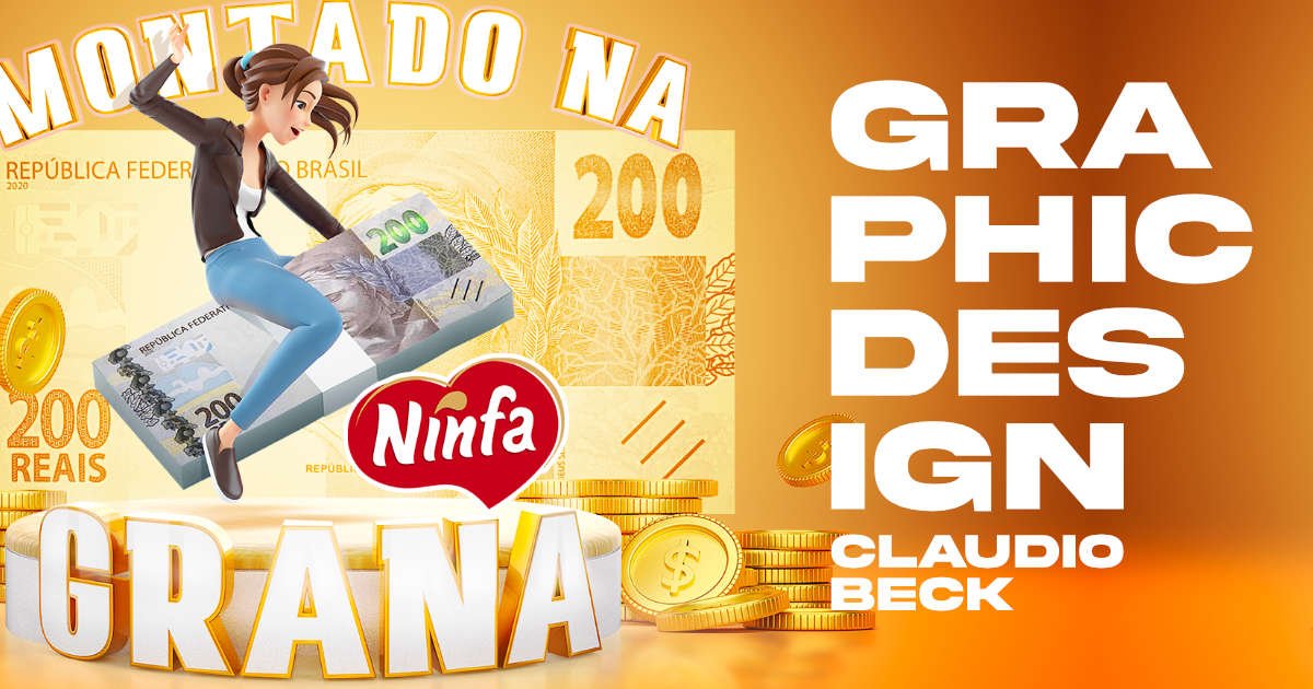
Graphic design for social media and ad campaigns is one of my daily routine services.
By having a visually appealing design, you can grab the attention of your target audience and make a strong first impression. This increased visibility can encourage people to interact with your content, leading to better engagement and a stronger connection with your audience.
Additionally, a consistent and professional graphic design style will help establish your brand identity, making it easier for people to recognize and remember you. This can also lead to higher conversion rates, as a well-designed ad campaign can create a sense of trust and credibility. A visually stunning design can also encourage people to share your content, increasing its reach and helping to build brand awareness.
Good graphic design is directly related to brand awareness.
By standing out from the competition with a unique and creative graphic design, you can make a lasting impression and express your unique corporate philosophy.
Package design and packaging assets
A well-designed package not only catches the consumer’s eye on the shelf but also conveys information about the product, creating a memorable and appealing brand image.
I usually create package design based on the market trends and we explore together creative ways to make it stand out based on the client´s budget, resources and time.
I design packaging for food industry, medical, pharmaceutical, luxury and other industries.
The package design for the pharmaceutical product based on CBD hemp oil was created with the objective of making it easy for veterinarians to find the right medication at a glance on the shelves.
character and mascot design
A mascot can create a strong brand identity, making it more recognizable and memorable to the target audience.A well-designed mascot can also evoke emotions and create a personal connection with people, leading to increased engagement and brand loyalty. Additionally, a mascot can be used across various marketing materials, such as advertisements, websites, and packaging, adding a fun and engaging element to the brand’s image. It can also help to communicate the company’s values and personality, making it easier for people to understand and connect with the brand.Thanks for watching!━
✉️ Email me for project comissions: comission@claudiobeck.com
🤝 Connect with me on LinkedIn: www.linkedin.com/in/claudiobeckCheck other projects
-

Branding Case
Selected branding case
Full corporate identity design, marketing and communication strategy
This branding case is my most extensive work ever done for a single client.
It starts with a logo design and new brand guidelines to help shape a new mindset from top-down. It took many months until completion.
UNICA Corp is a company located in São Paulo / Brazil that outsources facilities services such as cleaning, security, gardening, parking, building maintenance, and catering for over 120 clients nationwide.
The company had 3,000 employees and the initial goal was to double the size of the company and triple revenue in 4 years. The ultimate goal was to make it attractive enough for purchase or fusion by other larger companies, which was achieved after 10 years of restructuring and assertive work in all departments, including marketing which I was responsible for 6 years.
Starting pointThe original logotype was bland and had a futuristic typeface. It also did not resemble all the services provided by the company.
original logo from 2014
We need an identity that shows the variety of our services, yet organized. It should also show us as a safe and solid company people can trust. We have a more horizontal corporate hierarchy and our services should be seen as integrated, yet modular.
original briefingFirst Rebrand
This was the first rebrand in 2016
I designed the new logo using 3 squared icon filled with flat colors to organize all the services into 3 main areas: facilities, security and food.
The new typeface resembles the original one but is steadier, provides a and provides better legibility.
The form is ultra-wide analog to horizontal hierarchy and also to the extend of services offered.
As brand manager, I created a new slogan that sells value. It reads “We work to delight.” This was a surprise to all employees and clients, and soon beagn to be part of everybody´s daily lives.
Icon used on the company´s app
Company fassade in the early stages of rebranding
Fleet of operational vehicles
I also designed logotypes for the services offered for external and internal targets such as clients and employees.
And after a year all the company was already living the new mindset nurtured by the outlined new brand.
Uniform design
Innovation room was designed to collect new ideas from employees and clients
Interior design kept the branding guidance I designed
During this period of time, even with low investment in marketing and almost no team to give support, I managed to design more than a hundred different assets for specific clients and specific branches. This included video content which you will find at the end of this page.
Nevertheless, I designed the brand-specific roles keeping the essence but flexing to cover fragile spots as long as the board of directors kept correcting the business direction.
Service design to to value company´s portfolio
Each room was designed for a purpose
Meetings and cross-departamental colaboration
Smart totens designed to receive feedback were connected in all clients
Fleet variations were designed to specific roles
Original photo sessions for designing institutional booklets
We also participated in events
Seasonal and themed campaigns events included strategy, event branding, communication and implementation.
Second RebrandWe love the logo, colors are meaningful for us and the slogan is an absolute killer. Our business is more profitable when selling security services and, now on, we want to focus on that.
Rebrand our company keeping our colors but focus on security and, above all, it should resemble the looks of Google´s so people see us as an innovative company as well.stated the briefingAfter 3 years and with the guidance of a strategy consulting partner, the company found out that other services than security would not leave great profit margins, therefore, we had to re-design the company identity to position itself as a security outsourcing provider, yet, keeping the DNA that was already a success.
Don´t forget. It should resemble Google. It should resemble security. It should keep our colors.
reminded me the CEO
Google´s brand identity in 2019
The shield was designed approved as icon
Company name now has two levels but kept the same typeface
Color palette variation for monochromatic applications
Positive / Negative
Color palette
Blueprint
Primary / Alternate
Block proportion
Shape build history
3d project for main office facade
I designed the new logo following the client´s vision in a smart way to convey all the values the company, now, has to offer.
It features a much clearer service statement and is very flexible to fit a variety of situations.
The company gained a complete new arsenal of technology introduced in its Compliance, which became an indissoluble part of its brand.
For this, new communication assets were unfolded and designed in order to make the new brand noticed in the market. That included a whole new Social Media strategy and visual appeal, presentations, printed booklets, office interior design, stationary, virtual business cards, redesign for the entire vehicle, drones and electric bikes fleet as well as uniforms and a critical website update.
Compliance redesign
New CUBO room is filled with hi-tech hardwares and softwares.
A set of teaser videos showcasing news were filmed and edited by me
Another set of videos shows operational vehicles in action
Leadership Programme flyer design
Design template for Social Media
Security vehicles fleet design
Special vehicle brings education to employees nation-wide
Printed ads for indoor use
Innovation room revamped with a new portfolio of electric vehicles.
Security division got vehicle fleet and uniform design updates
It would take more pages of content to present the many other materials that were designed over the 6 years that I was at the head of the company’s communication and marketing department, acting mainly as brand manager and advising on internal and external communication in all points of contact with target audiences.
Below you will find a compilation of video teasers, mostly operational training, which were used as promotional material without the traditional characteristics of advertising.
During COVID pandemic crysis, the aid of biometric tech was a life saver
Thanks for watching!━
Connect with me on LinkedIn: www.linkedin.com/in/claudiobeck -
Sativa Vet Package Design
Package Design
paketdesign / conception de l’emballage /design de embalagem
An excellent package design should be visually appealing, functional, easy to use and communicate key information to the consumer.
This can be achieved through the use of design elements such as color theory, typography, and hierarchy of information. Additionally, it should use appropriate design elements, materials, be user-friendly, sustainable and comply with industry regulations and standards.
This package design for the pharmaceutical product based on CBD hemp oil was created with the objective of making it easy for veterinarians to find the right medication at a glance on the shelves. One of the key elements of the design is the use of large percentage numbers, which are prominently displayed on the front of the package. This allows veterinarians and pharmacists to quickly and easily identify the concentration of CBD in the product, making it easier to choose the right medication for their pet patients.
The design also features bold, eye-catching colors and a clean, modern aesthetic that is sure to stand out on store shelves. The use of high-quality materials and a sturdy construction ensures that the package will hold up well over time, even in busy veterinary clinics and pharmacies.
Overall, the package design for this CBD hemp oil product is both functional and visually appealing, making it an easy-to-recognize medication.
━
Project inquiries: comission@claudiobeck.com
Thanks for watching!━
✉️ Email me for project comissions: comission@claudiobeck.com
🤝 Connect with me on LinkedIn: www.linkedin.com/in/claudiobeckCheck other projects
