Category: Featured

  • Engates AnexoA

    Engates AnexoA

    Engates AnexoA

    Multimedia Product Catalog

    AI-Generated

    Graphic Design

    WebDesign

    The Project

    Anexo A is a brazilian company focused on industrial automotive metallic parts and their key product are towing coupling for Stellantis, owner of such brands like Jeep, Chrysler, Fiat, Peugeot, Citröen, Maseratti and many more.

    The company’s pain was their overall poor web presence and product catalog. Our project is based on a multi-checkpoint strategy, starting with their key product: tow coupling. After discussing the options I presented and what the company needed as priority, I advocated for an online catalog such as a webpage where it would be easier to update content, pictures and technical data, better to control access, and we can make use of multimedia elements. After getting the OK for this asset to be created, I decided to use AI-generated content to squeeze the maximum of our allowed budget and deliver a cinematic hero splash screen.

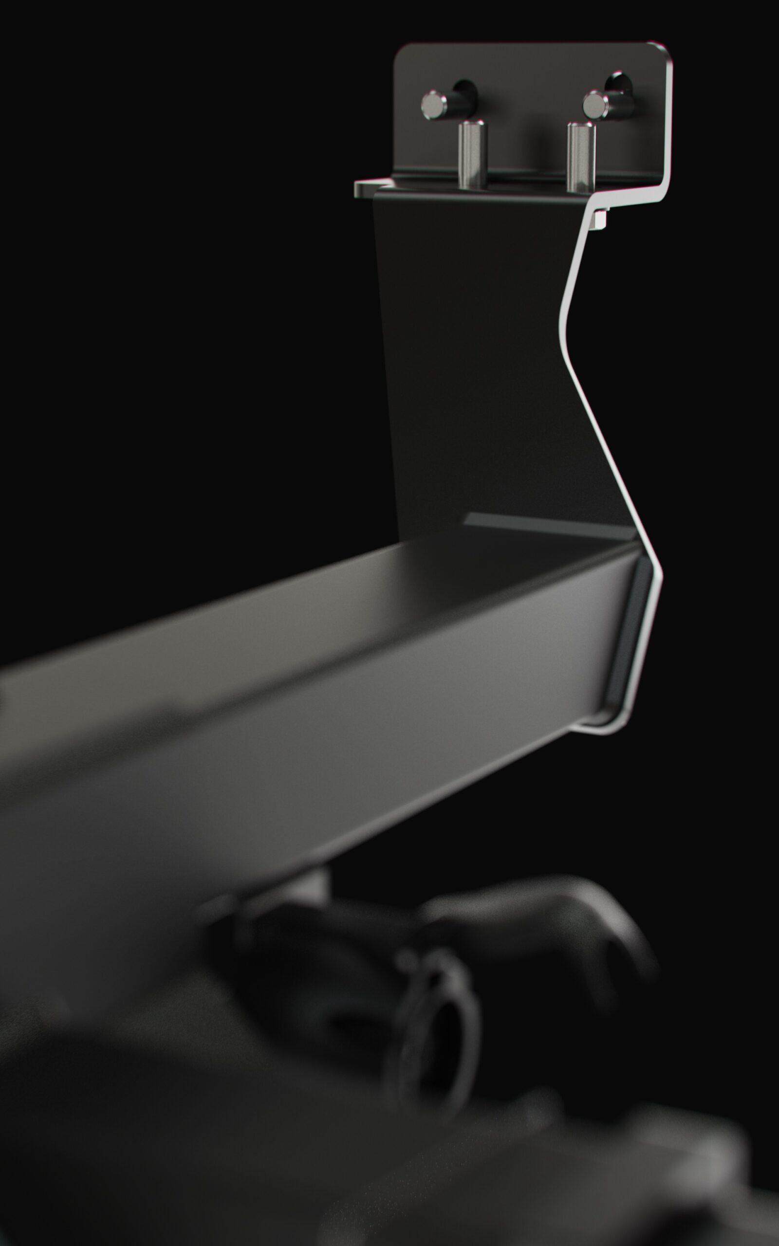
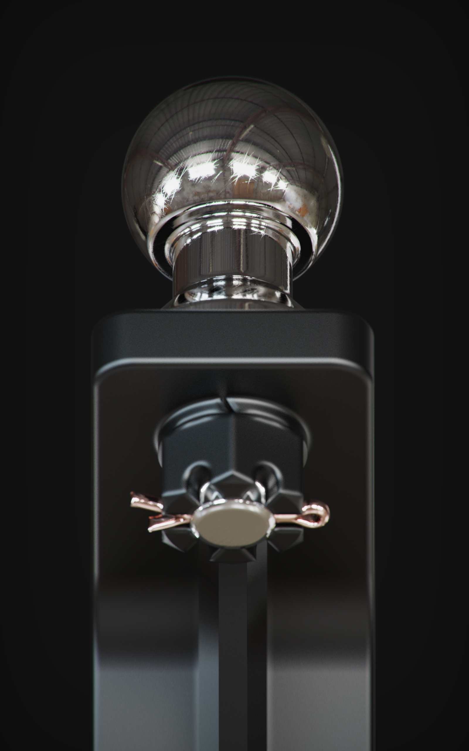
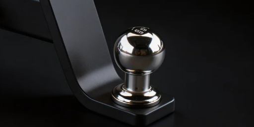
    For the product catalog images, I had access to all the product CAD files and then I rendered everything using Luxion’s Keyshot, so we had acurate and beautiful shot of each product, perfectly aligned to camera angles favouring its intricate structure, over a plain neutral background to be used alongside the webpage.
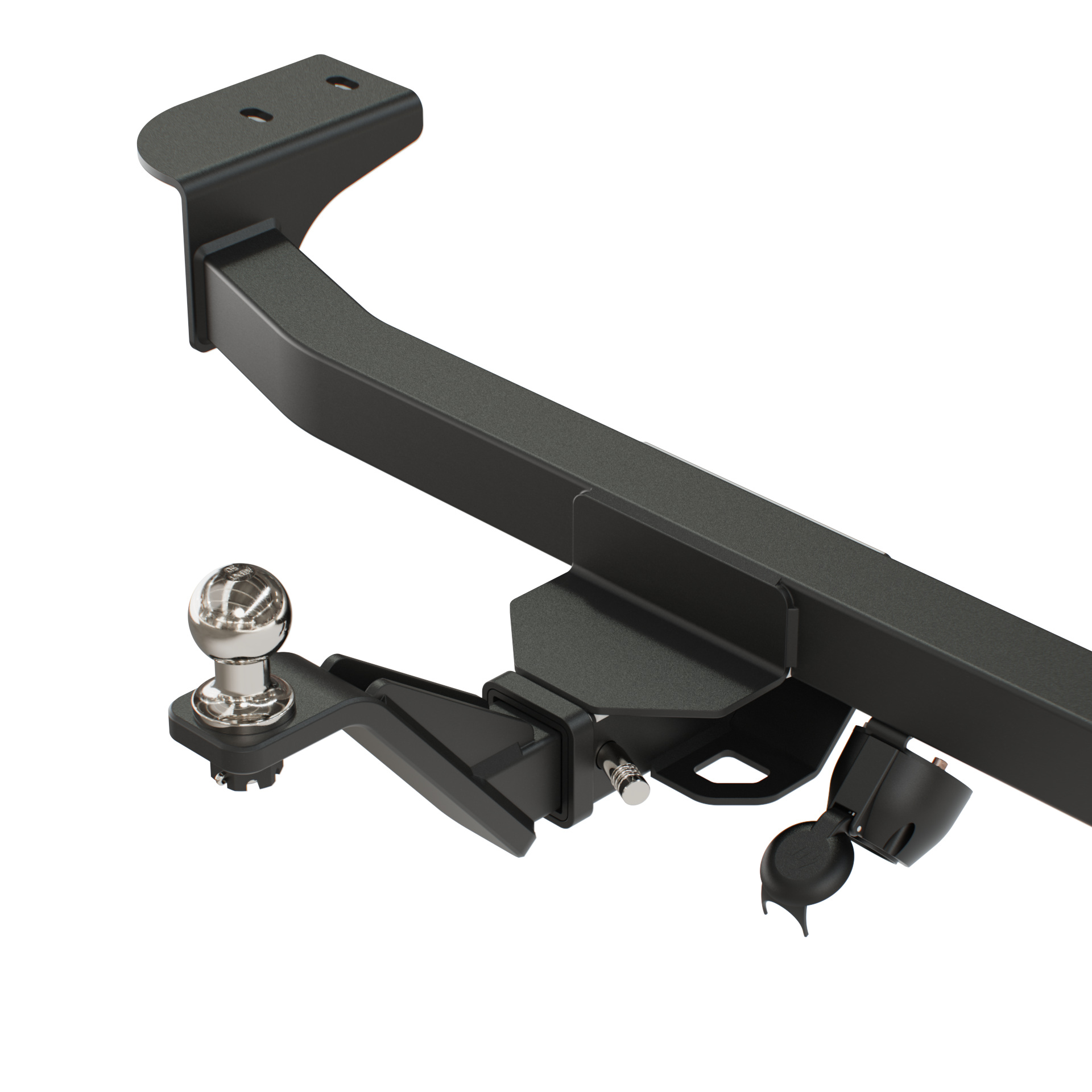
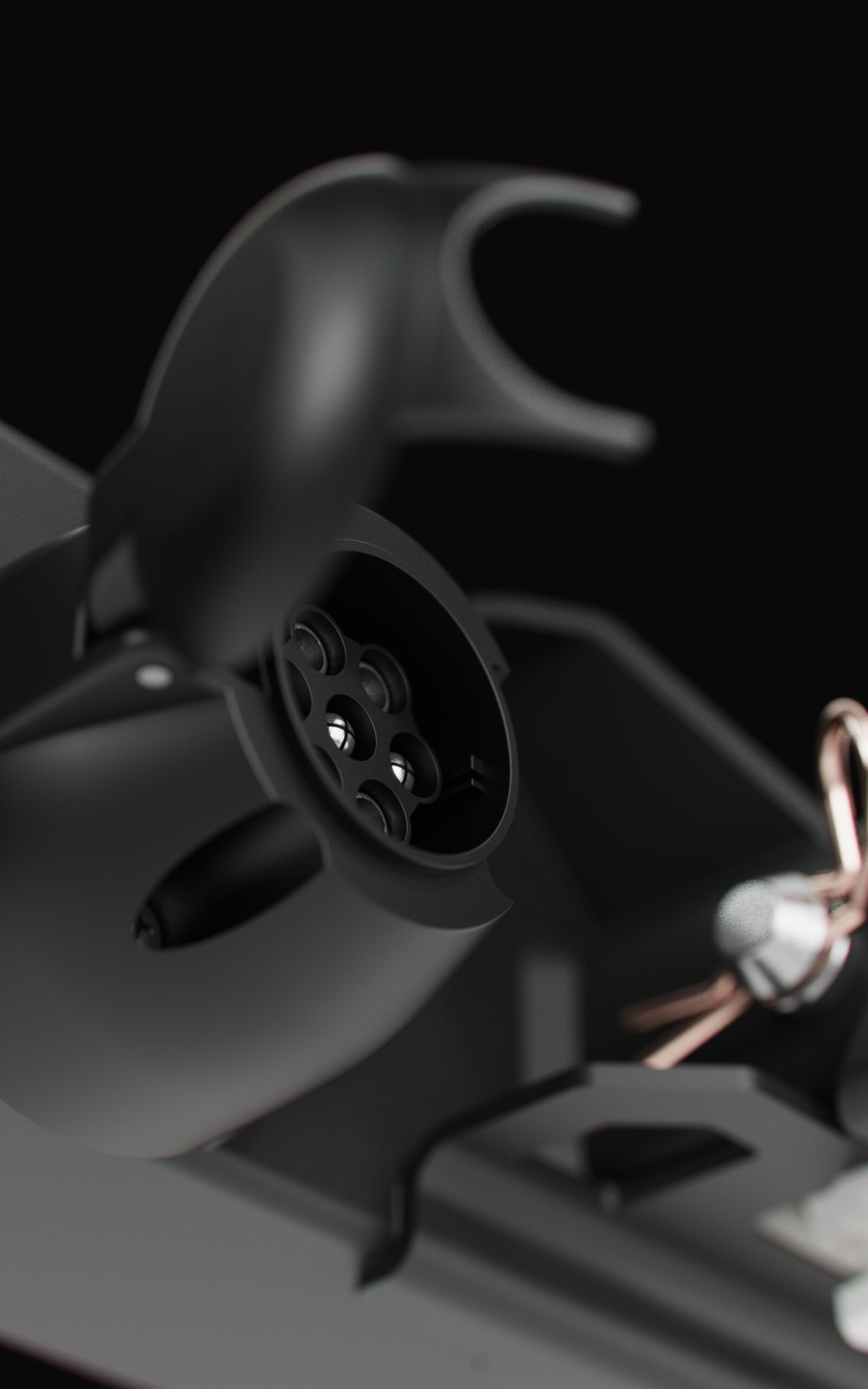
    3d rendered assets

    All the products were treated in a 3D environment in order to be textured with the right materials parameters and scale.

    I crafted render shots in neutral background color and studio lighting setup to highlight the maximum of each and every detail, giving a premium feel and aesthetics to the product.
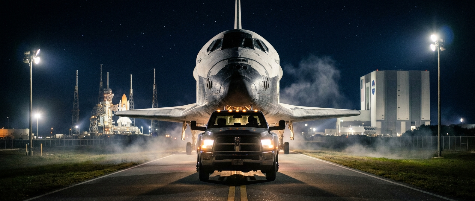
    The cinematic video

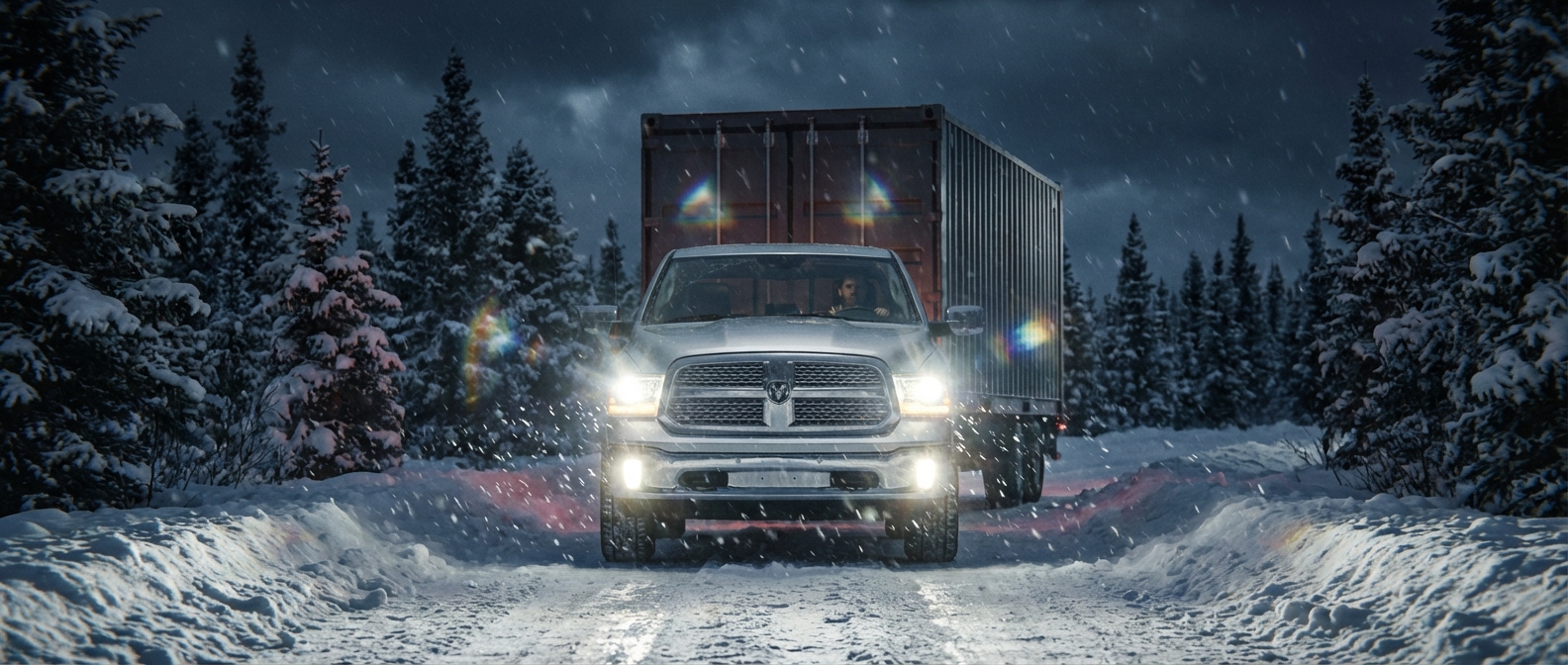
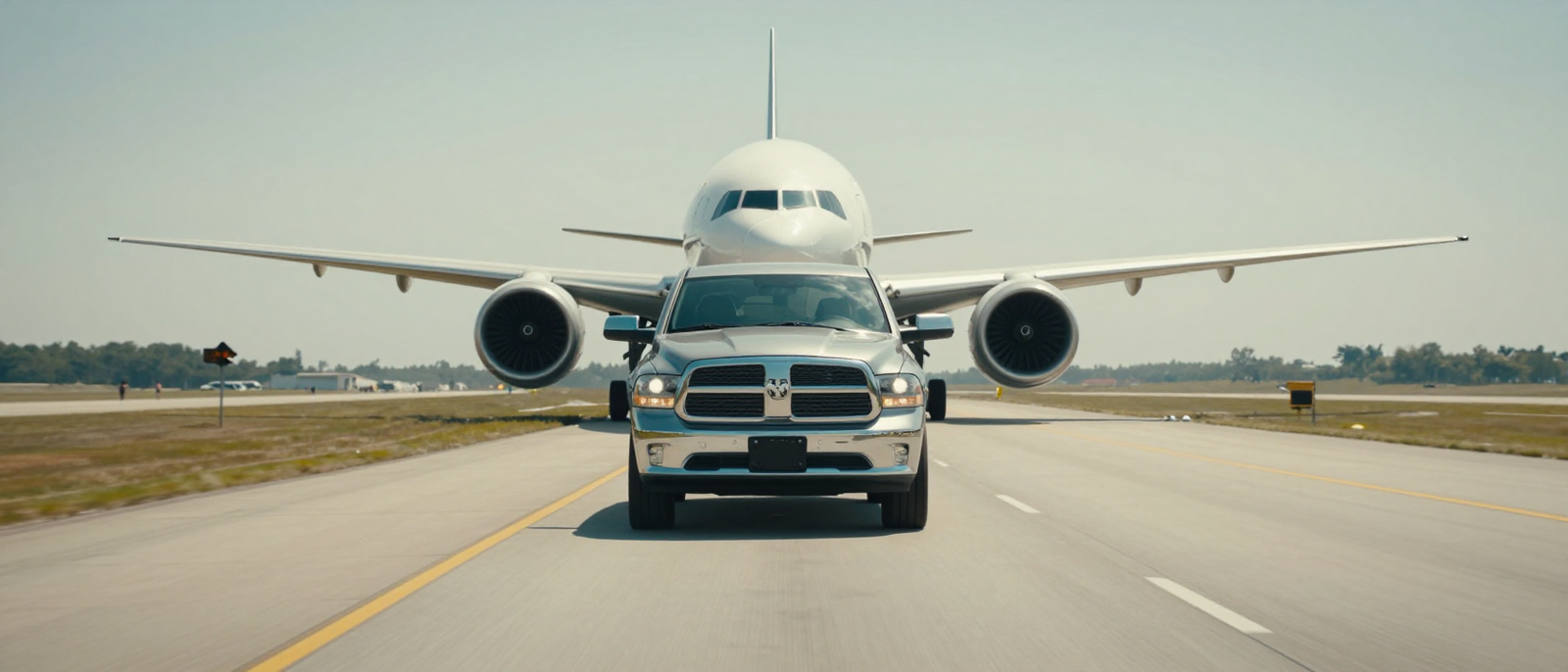
    The most impactful section of this online catalog is the cinematic video on the hero section.

    Were not for the licensing fees from the 3D software used to render, this could have been the most expensive portion of the project.

    In order to get the artistic direction I was seeking, I had to experiment and combine many AI agents together, from scripting the scene direction and photography, to fine tuning the end prompt.

    It took weeks between finding the prompt recipe combining real world cameras models and brands, lens types and brands, post-production and in-capture glare effects, plus the training sessions of each vehicle to render and behave accordingly each make and model.

    The end result is a stunning cinematic shot compilation with aesthetically light leaks, subtle chromatic aberration and real world dynamics, all later on edited, color corrected and stitched together using Adobe Premiere.

    Each vehicle model was curated and trained as a separate LORA or character, then inserted in a meticulously crafted prompt. Not only this steps were necessary to achieve a realistic cinematic video, but I had to experiment with so many different AI models ranging from WAN (all of their available versions), LTX, Higgsfield native, Seedance (both models), Kling 3.0, Minimax Hailuo, the most expensive of all agents SORA and I even experimented with Grok.

    All in all, it was a fun process, although a bit costly, certainly cheaper than having it recorded in real life with real vehicles, cameras and personel. Having to wait long minutes between each generation ended up costing myself long nights awake just to change a coma or a word to get better results.

    CLIENT

    ANEXO A (Brazil)

    PROJECT SCOPE

    WEBDESIGN
    PROMPT ENGINEERING
    VIDEO EDITING

    SOFTWARE

    MAYA
    PHOTOSHOP
    AFFINITY DESIGNER
    PREMIERE PRO
    KEYSHOT
    HIGGSFIELD
    COMFY UI
  • Kreiselfest 2026 – Zollikofen

    Kreiselfest 2026 – Zollikofen

    Kreiselfest 2026 – Zollikofen

    Joyful Brand Identity for the city’s mega-fest

    Branding

    Graphic Design

    WebDesign

    The Project

    The Kreiselfest (or Roundabout Festival) in the city of Zollikofen, Switzerland, is a large community festival taking place on the main avenue closing the traffic to host the mega-party for two consecutive days, to happen on 4th and 5th September this year, 2026.

    The project is lead by a committee of 40 decision-makers executives that plays a significant role in the city economy. After presenting my brand project’s entry for the event, it was finally awarded as winner and the committee officially adopted this Brand Identity System.

    the Kreiselfest Design System

    The briefing was clear:

    • Logo must have circular or radial elements to remind the two roundabouts where the festival takes place.
    • Logo must be joyful.
    • Logo must depict some kind of movement.
    • Logo must depict music.
       

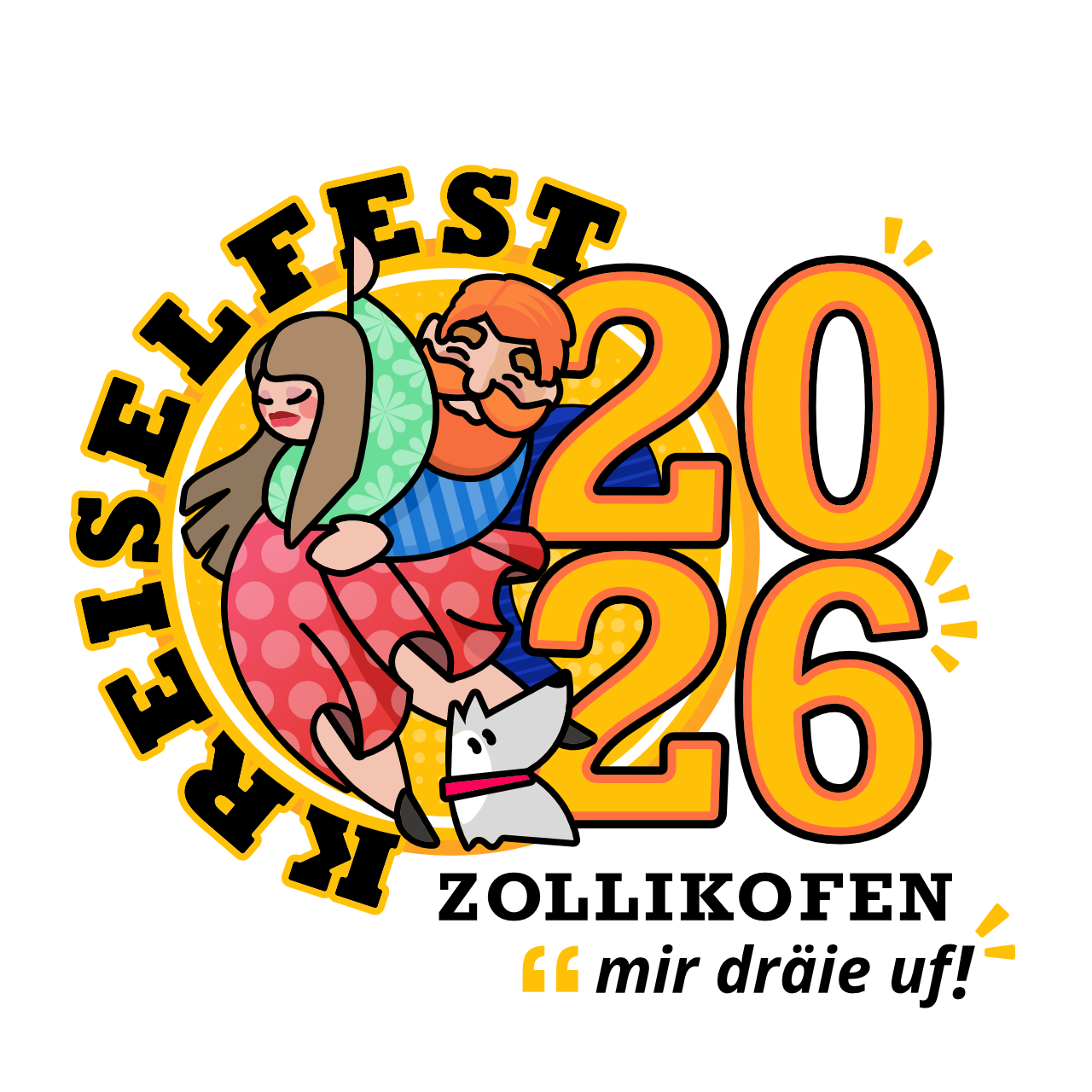
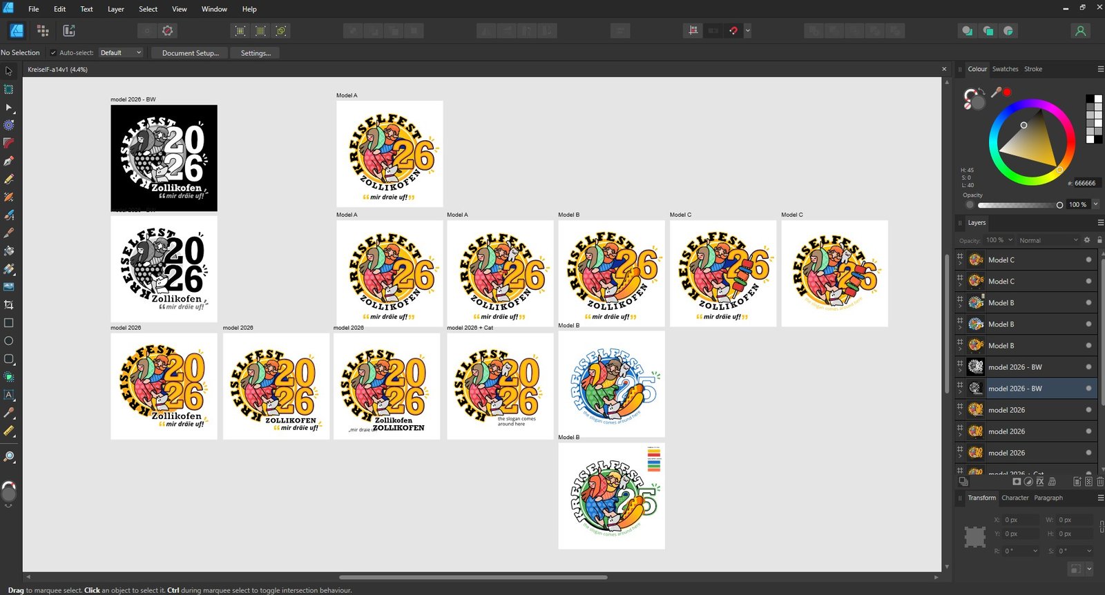
    Based on that I designed the main core logo elements and presented five versions with various elements to choose from, including: dog, cat, hot-dog, barbecue on a stick and number pairing variations.

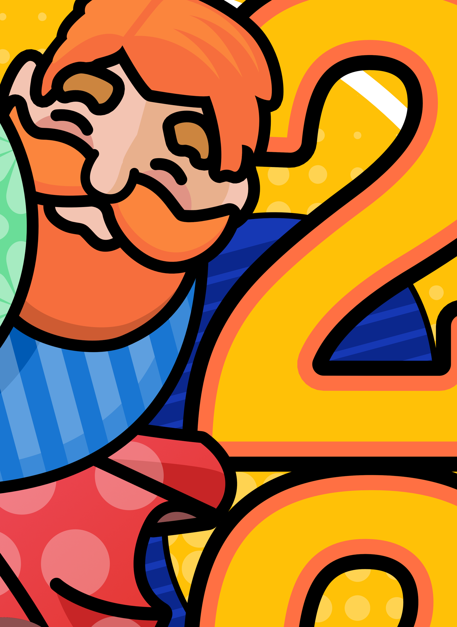
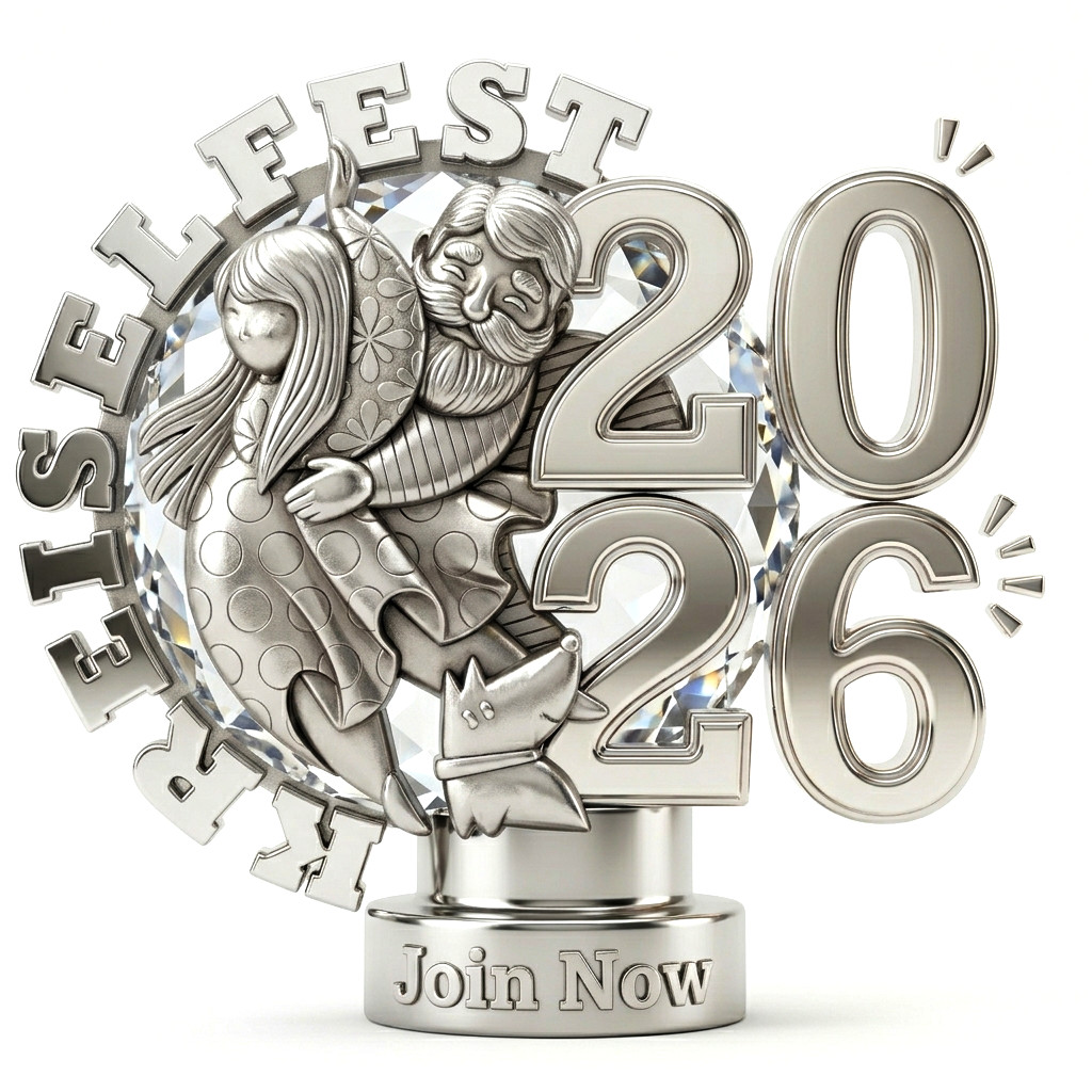
    The chosen version is the one with a dancing couple, a cute dog looking to the huge number pairing 2026 hat houses comfortably the city’s name and the provided slogan.

    The inspiration

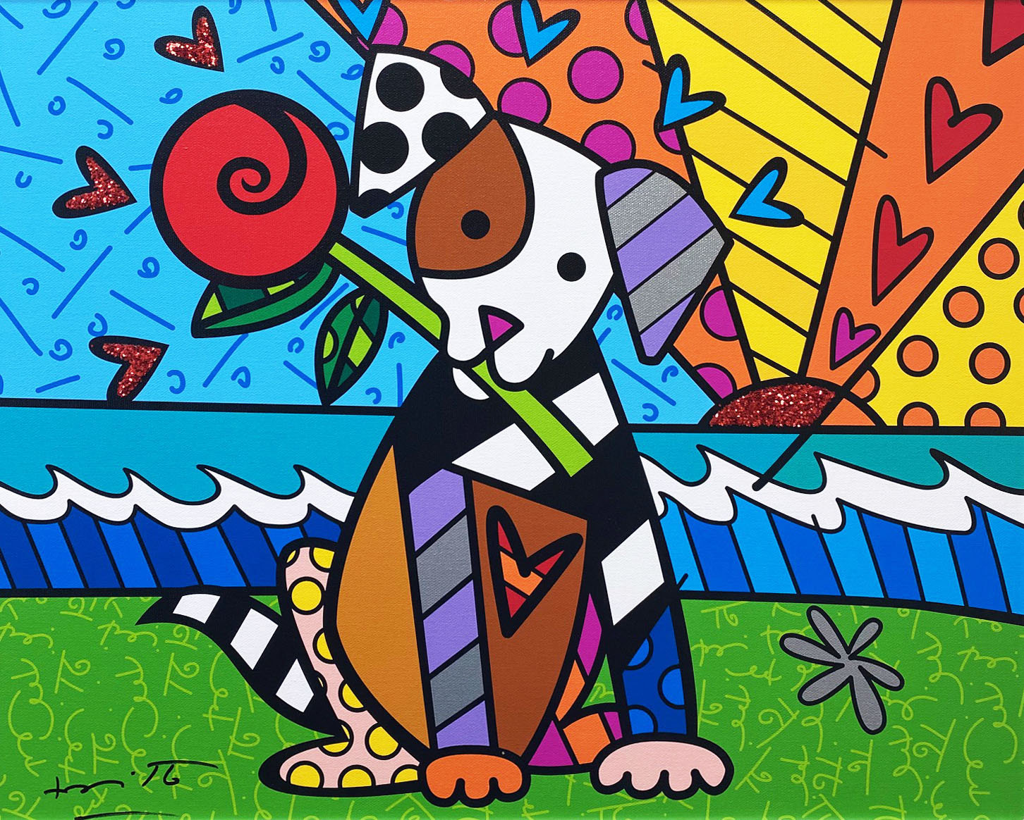
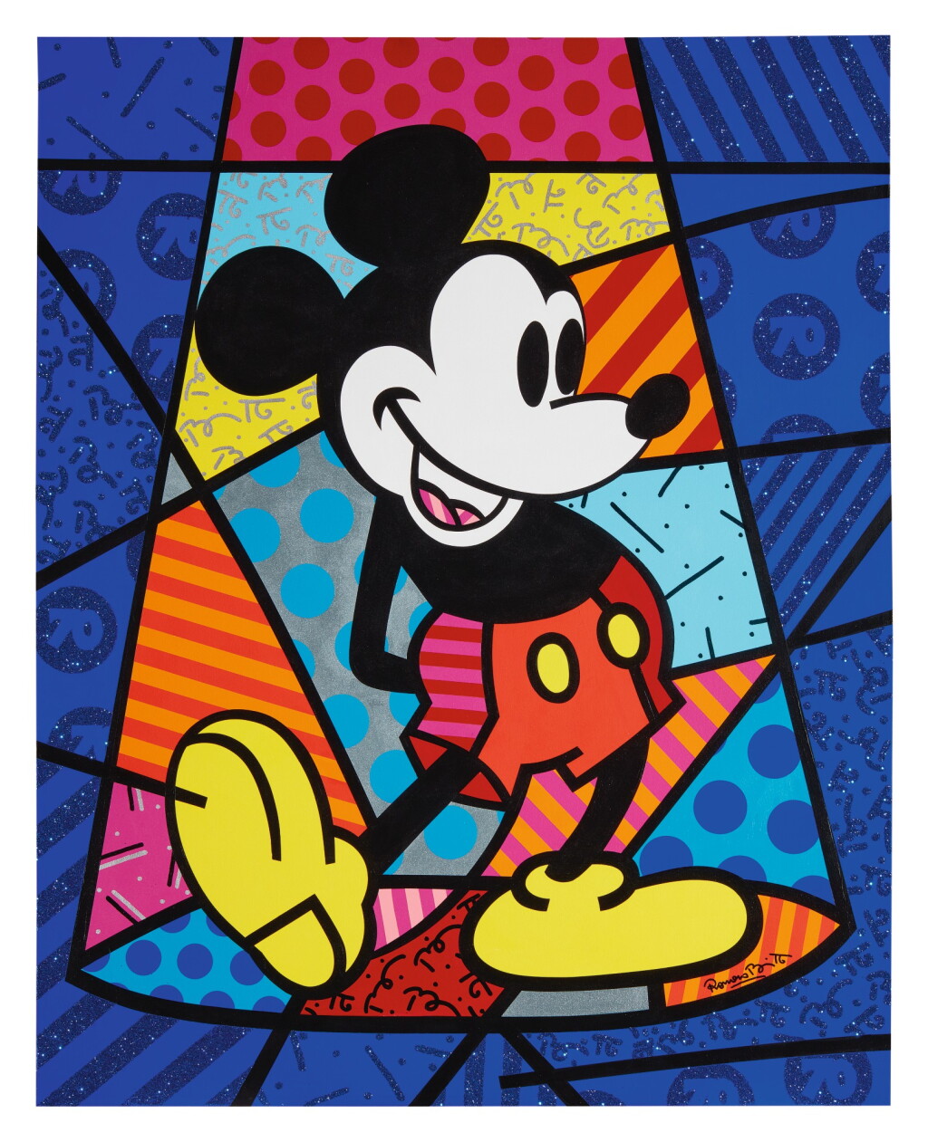
    As to the aesthetic, I took inspiration on the Romero Britto’s artwork, a renowned Brazilian abstract painter, now living in Florida, USA.

    He defines his own artwork as happiness, has an extensive gallery of random subject paints and prices from his canvas can reach up to US$ 2 million for a single painting.

    The vector-like strokes and precise bold lines filled with colorful patterns looks great on digital and printed media, thus, being my first choice to elaborate on the subject.

    Although this being a starting point, our Kreiselfest Brand came out with my own point of view, with quite different line design, weight, clear boundaries, cleaner pattern and a technically controlled color palette.

    The Design Process

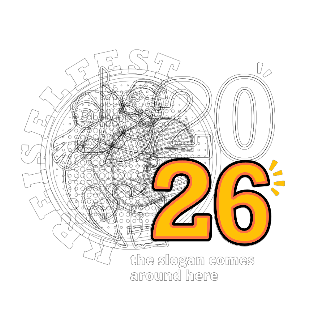
    It started with many pencil sketches in my notebook until I found the circle formation with elements inside and typography outside.

    Once found the core composition, I designed the shapes in vector software and fine-tune all the measurements and adjustments to balance and fit all the elements.

    After that I refined the colors to a limited palette and applied many combination until the most balanced and harmonic was found.

    Kreiselfest behind the scenes
    Behind the scenes: ongoing process with multiple versions

    The final approved version later on included a second logo and a website. The project counts many dedicated worked hours, and it is still ongoing as website evolves. Don’t miss to visit the official Kreiselfest website as well.

    Technically, the logo was a complex puzzle of shapes and patterns, but aesthetically it looked smooth and easy on the eyes.

    Shortly after the logo was done, I got a request to expand the project to a second logo, this time for the side event, the music festival.

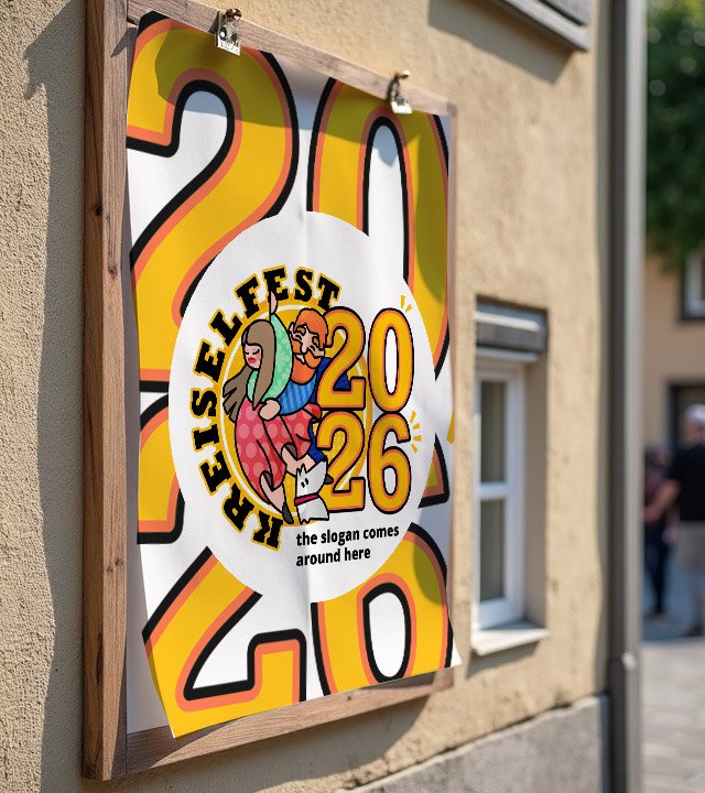
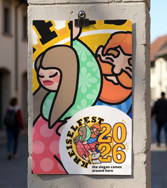
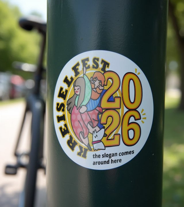
    Before diving into the complimentary logo, the next step of the process was to elaborate the brand guidelines and usage, as well as some mock ups with practical examples.

    The logo was also built to be modular and ready to be update next and upcoming years. The way I built it, it is quite easy to change 26 to 27 or whatever the year number that the next festival will be held.

    But I must admit, if I am to be honored again to manage the brand next festival edition, I would change the main character elements as well, so as the years and festivals goes by, we end up having a collection of logos with diverse characters, creating a world of its own.

    developing brand collateral based on the brand guidelines

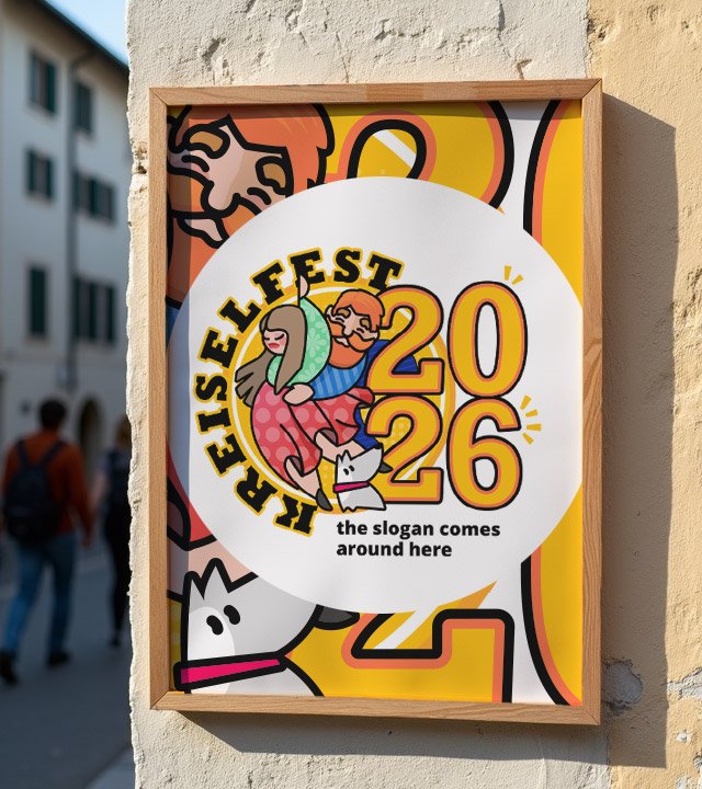
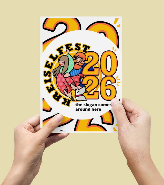
    The circular logo could face complex fitting into the square world of monitors and framing for printed media. The richness of this logo allows us to truly play around and find joyful compositions.

    This was done by isolating the logo in a radial neutral border and filling the background with a mixture of its elements, drawing the eye always to the main element and filling with uplifting vibe all around the composition in a less word and more color approach.

    zolli on stage logo

    The Music Event named Zolli on Stage was later added to the project and asked to be designed as a “twin” logo approach.

    For that I used the existing design system and tweaked the characters to a more explicit sign ( music player, singer, dancer ) and used a rather analog color palette with blue and purple being the main mood contributors as the music event usually tends to happen at night. 

    For me, personally, the great addition is the red and white striped pattern added to one character element, clearly honoring the Swiss flag colors and pattern seen in many historical buildings.

    In the end, the main Kreiselfest logo and the Zolli On Stage logo are a great pair that not only look alike, but complements each other to a greater feeling of the event.

    The Kreiselfest Website

    Since the website would have diverse content contributors, I designed the website using Elementor and WordPress for the ease of use and access. The web project started on the brand guidelines and quickly evolved to a website with many pages.

    The key design characteristic is the absence of angular and sharp edges, as the entire project relies on rounded and radial shapes, that also applies to boxes, buttons and sections dividers.

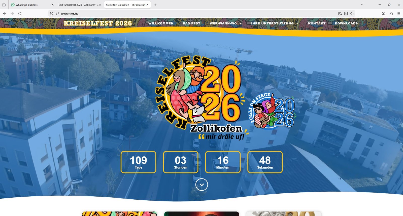
    For the front page I applied a hero banner with a drone-video footage running on the background, showing the overview on where the event will take place. The huge logo is the center piece accompanied by it’s “twin” Music Event logo. Then we have a feature that has a practical role: the live countdown timer, marking the exact time the event will start. Below the fold, we have updated information from the blog.

    CLIENT

    KREISELFEST / ZOLLI ON STAGE (Switzerland)

    PROJECT SCOPE

    BRANDING
    WEBDESIGN

    SOFTWARE

    PHOTOSHOP
    AFFINITY DESIGNER
    WORDPRESS

    My final thoughts on the project

    The project delivers vital information to the public, sells the event to sponsors and will be used as a memory multimedia album after the event. Driving a traffic of thousands of accesses daily, it grew organically with the help of the communication team through an open WhatsApp channel and social media like Instagram.

    This was a rather “different” project, far away from what I am really used to, corporate and serious toned businesses, and I must admit I had fun creating it. To use a more playful color palette and to design characters for a logo, was something I enjoyed and tested my skills at the same time.

    I’d like to thank very much the sponsoring and trust from Intelliworld that not only made it easy for me to understand the project’s needs as well defended the project to the committee board. Huge thanks Scott!

  • KEUNE Cosmetics

    KEUNE Cosmetics

    KEUNE Cosmetics

    3D Render Product Visualization

    3D Modeling

    3D Rendering

    Product Visualization

    Graphic Design

    Fictional Project

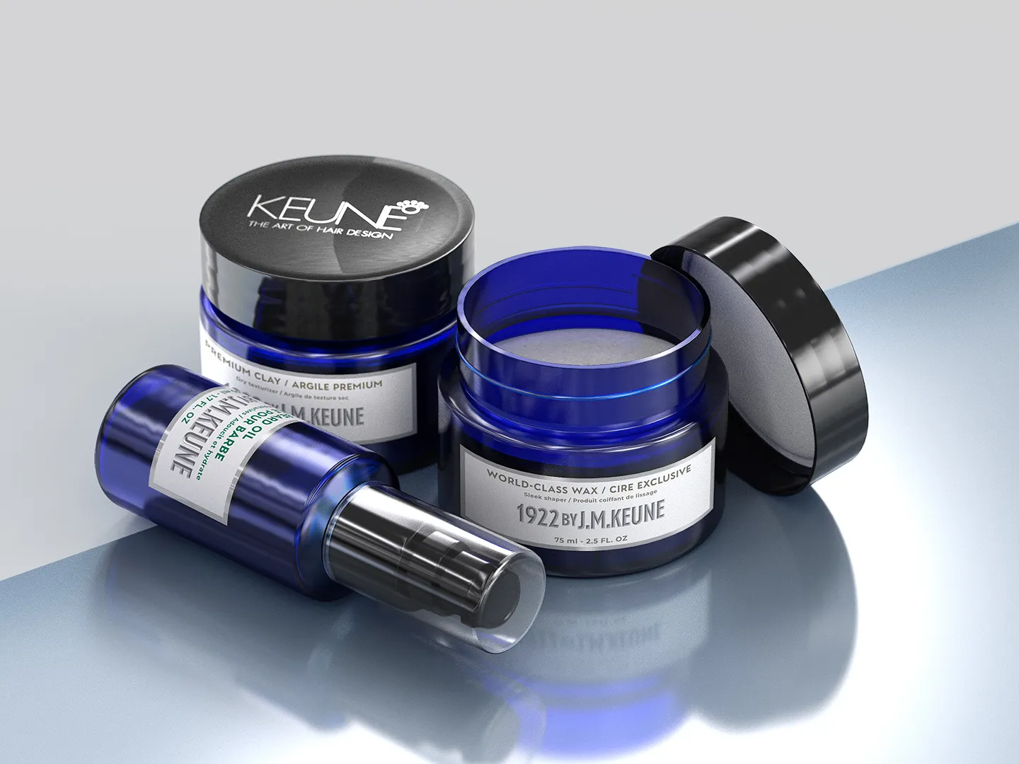
    Keune Cosmetics packshot

    I 3D modeled the contents of the image on the side using Autodesk Maya using as reference the real products.

    Labels were created using Adobe Photoshop and exported as PNG texture, both the white labels and the transparent cap label.

    The whole 3D composition was then rendered in Keyshot where I fine-tuned the materials, setup the HDRI environment and adjusted the settings for lighting. It was then rendered as a still image.

    Post-processing was done in Adobe Photoshop.

    CLIENT

    PERSONAL

    PROJECT SCOPE

    PRODUCT VISUALIZATION
    3D RENDERING
    MOCKUP

    SOFTWARE

    MAYA
    PHOTOSHOP
    KEYSHOT

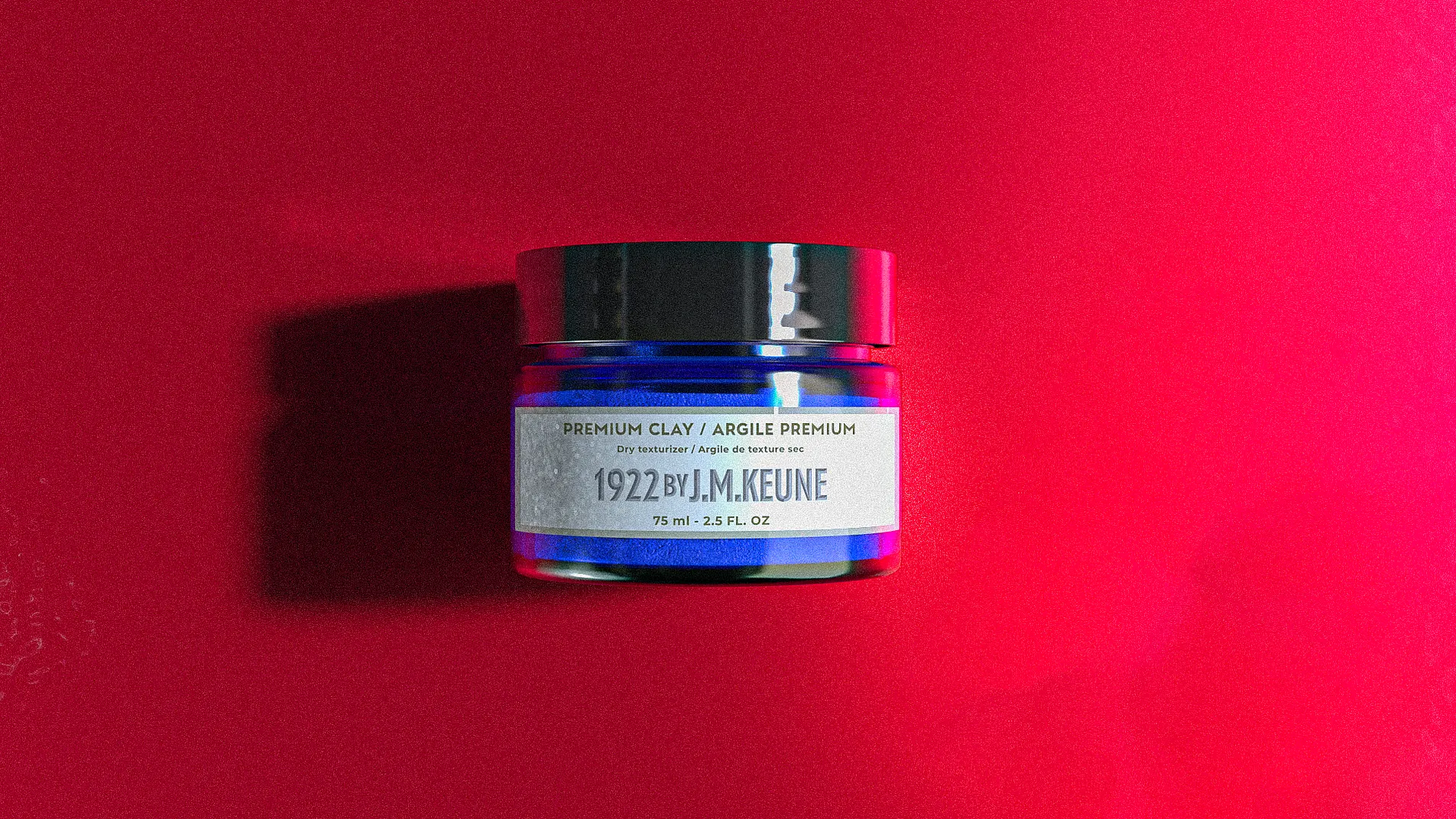
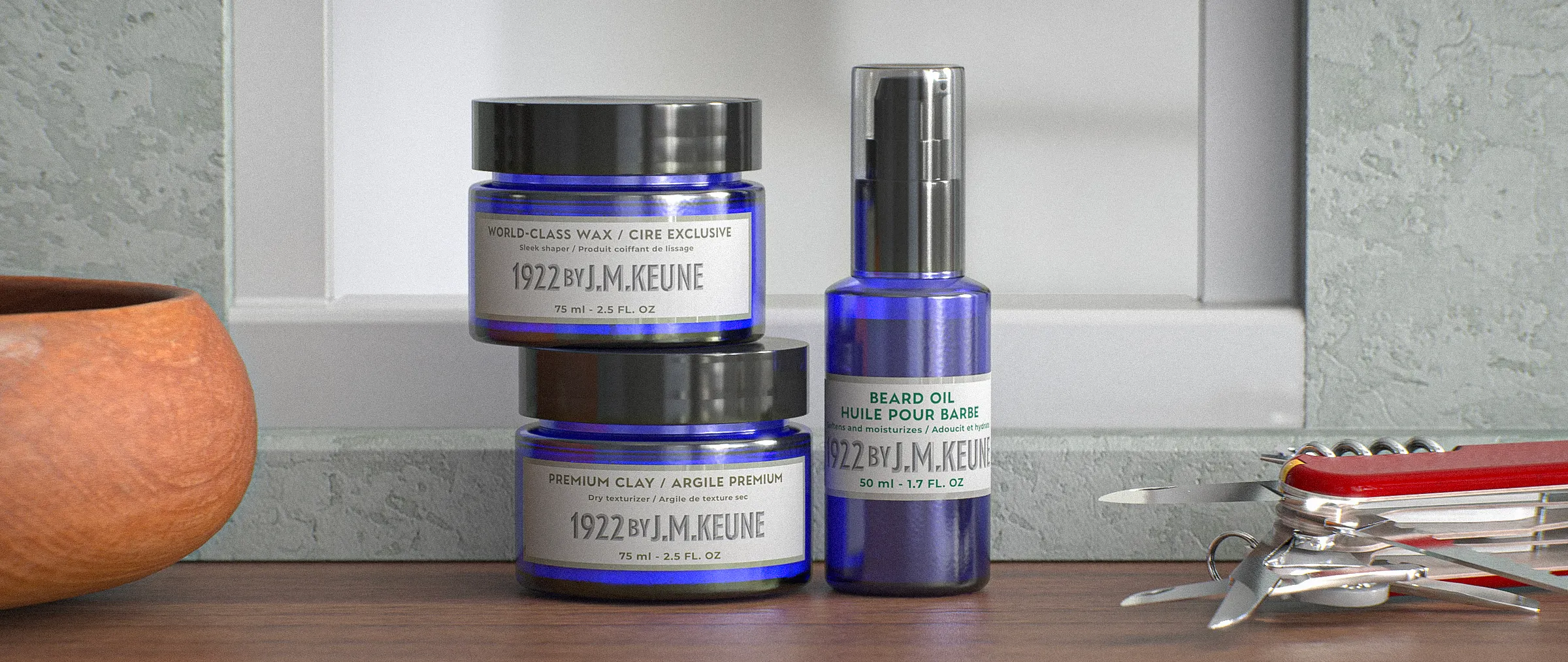
    Keune Packshot 3D Product visualization render
    KEUNE Cosmetics, 3D rendered in Keyshot
  • SativaVet CDB Oil

    SativaVet CDB Oil

    SativaVet CDB Oil

    Package Design for Pharmaceutical Industry

    Package design

    3d rendering

    Graphic Design

    mockup

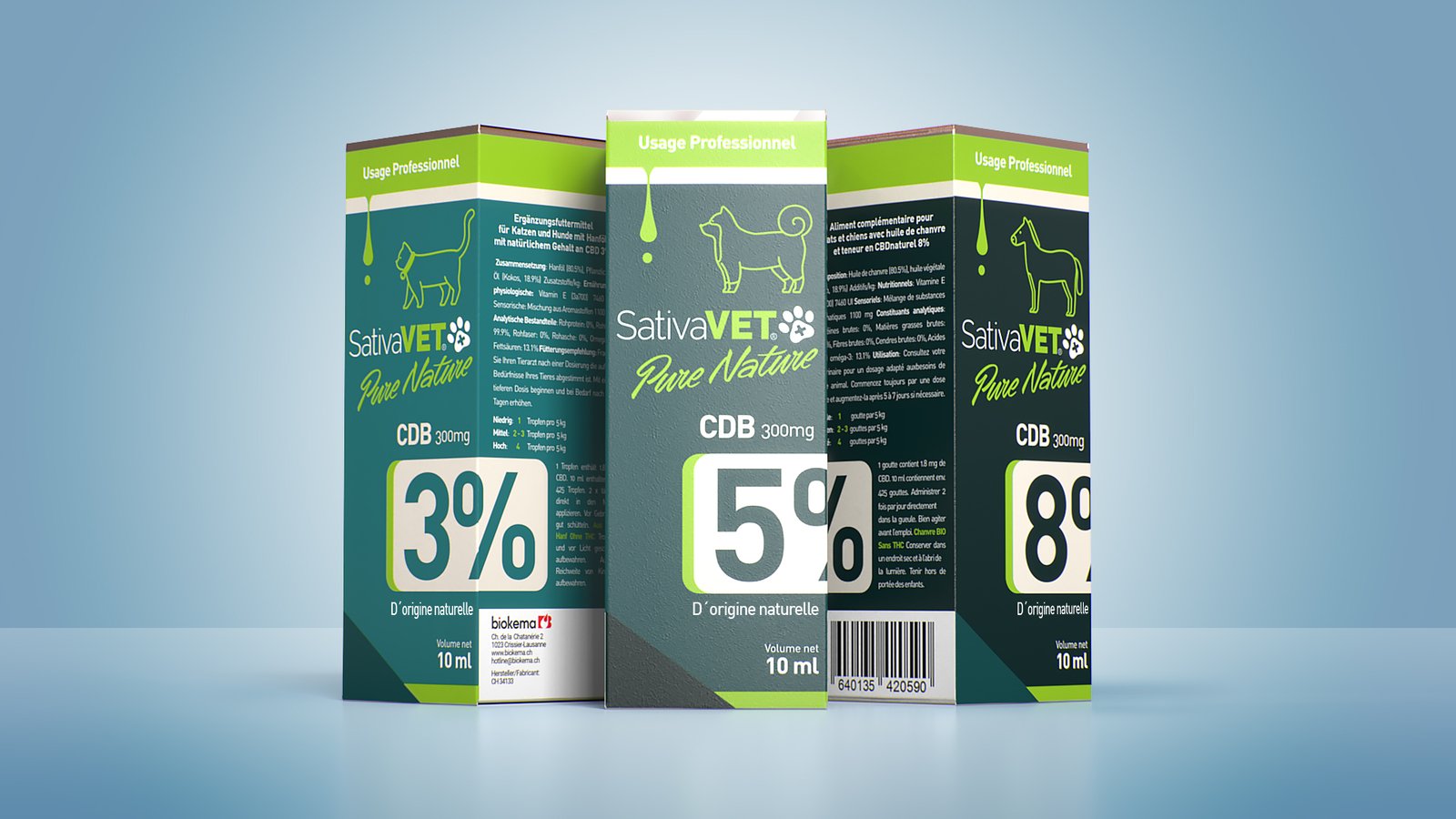
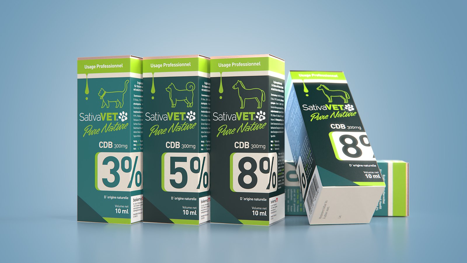
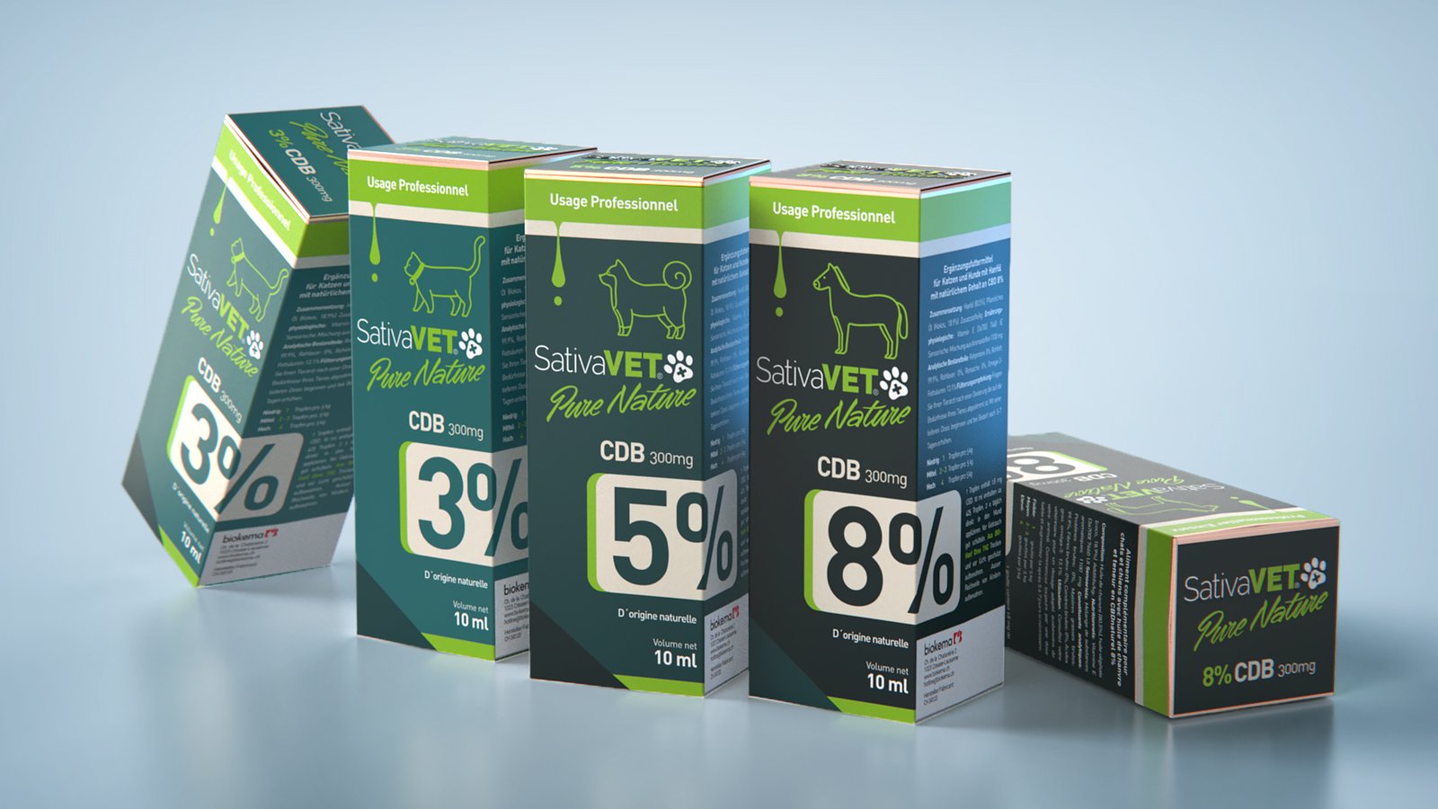
    Veterinary use CDB oil packaging redesign

    The original Sativa Vet Pure Nature’s CDB Oil family was facing a strong sense of outdated design and part of the request was that the CDB percentage could be more easily read for pharmacists and clients.

    I presented a package design with a consistent green color palette keeping the brand’s original color intact and displaying large percentage numbers on the bottom half.

    The animals icons and the liquid drop were symbols and icons requested to be present on the redesign as well.

    I added a hint of metallic finish on the top lip, as a golden stripe, to call the attention and contribute for a more premium finish, borrowing a sense of higher quality to the product overall.

    CLIENT

    SATIVA VET (Switzerland)

    PROJECT SCOPE

    PACKAGE DESIGN
    PRODUCT VISUALIZATION
    3D RENDERING
    MOCKUP

    SOFTWARE

    MAYA
    PHOTOSHOP
    AFFINITY DESIGNER
    KEYSHOT

plugins premium WordPress