Category: Branding

  • Kreiselfest 2026 – Zollikofen

    Kreiselfest 2026 – Zollikofen

    Kreiselfest 2026 – Zollikofen

    Joyful Brand Identity for the city’s mega-fest

    Branding

    Graphic Design

    WebDesign

    The Project

    The Kreiselfest (or Roundabout Festival) in the city of Zollikofen, Switzerland, is a large community festival taking place on the main avenue closing the traffic to host the mega-party for two consecutive days, to happen on 4th and 5th September this year, 2026.

    The project is lead by a committee of 40 decision-makers executives that plays a significant role in the city economy. After presenting my brand project’s entry for the event, it was finally awarded as winner and the committee officially adopted this Brand Identity System.

    the Kreiselfest Design System

    The briefing was clear:

    • Logo must have circular or radial elements to remind the two roundabouts where the festival takes place.
    • Logo must be joyful.
    • Logo must depict some kind of movement.
    • Logo must depict music.
       

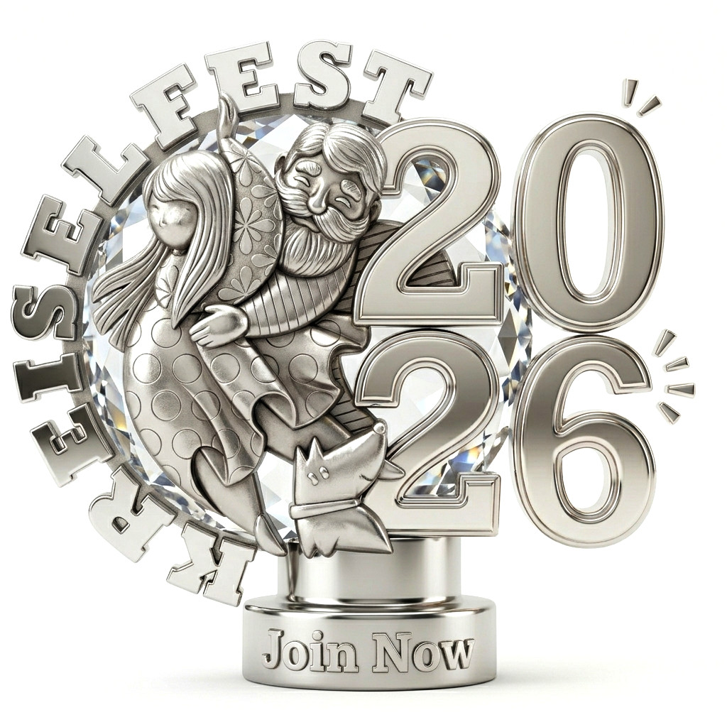
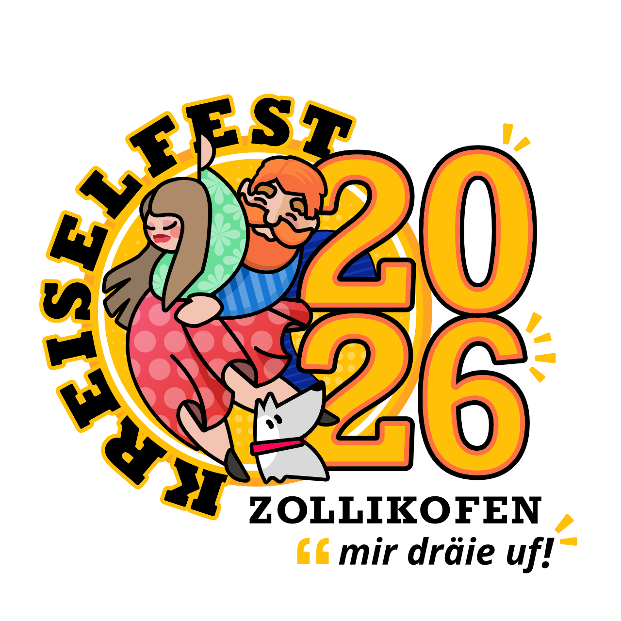
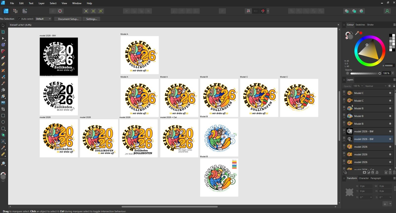
    Based on that I designed the main core logo elements and presented five versions with various elements to choose from, including: dog, cat, hot-dog, barbecue on a stick and number pairing variations.

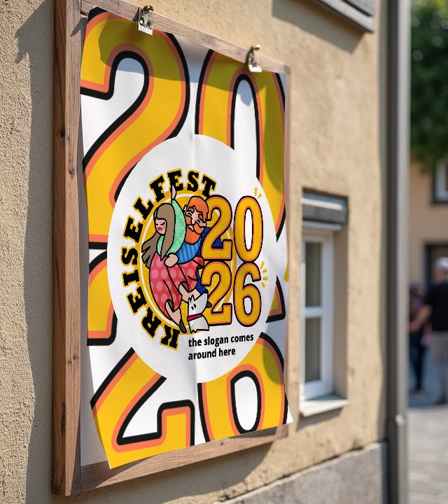
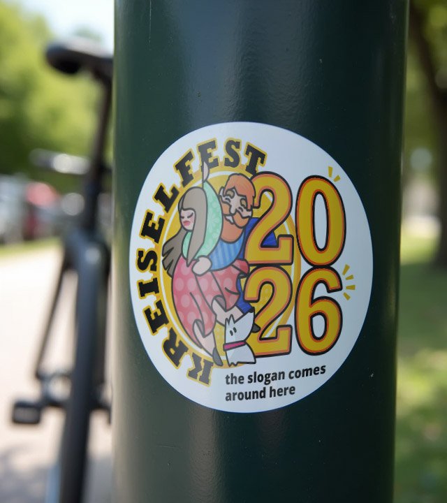
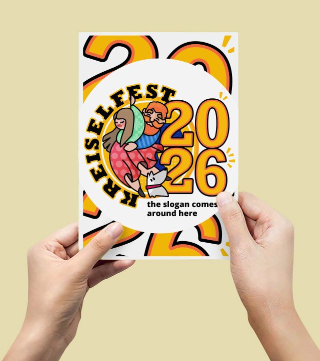
    The chosen version is the one with a dancing couple, a cute dog looking to the huge number pairing 2026 hat houses comfortably the city’s name and the provided slogan.

    The inspiration

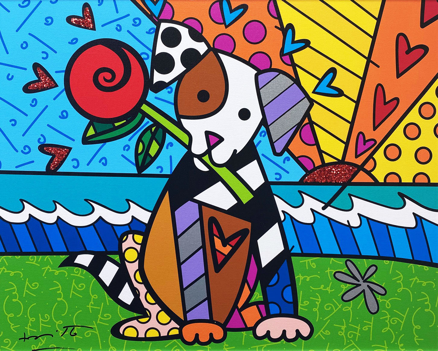
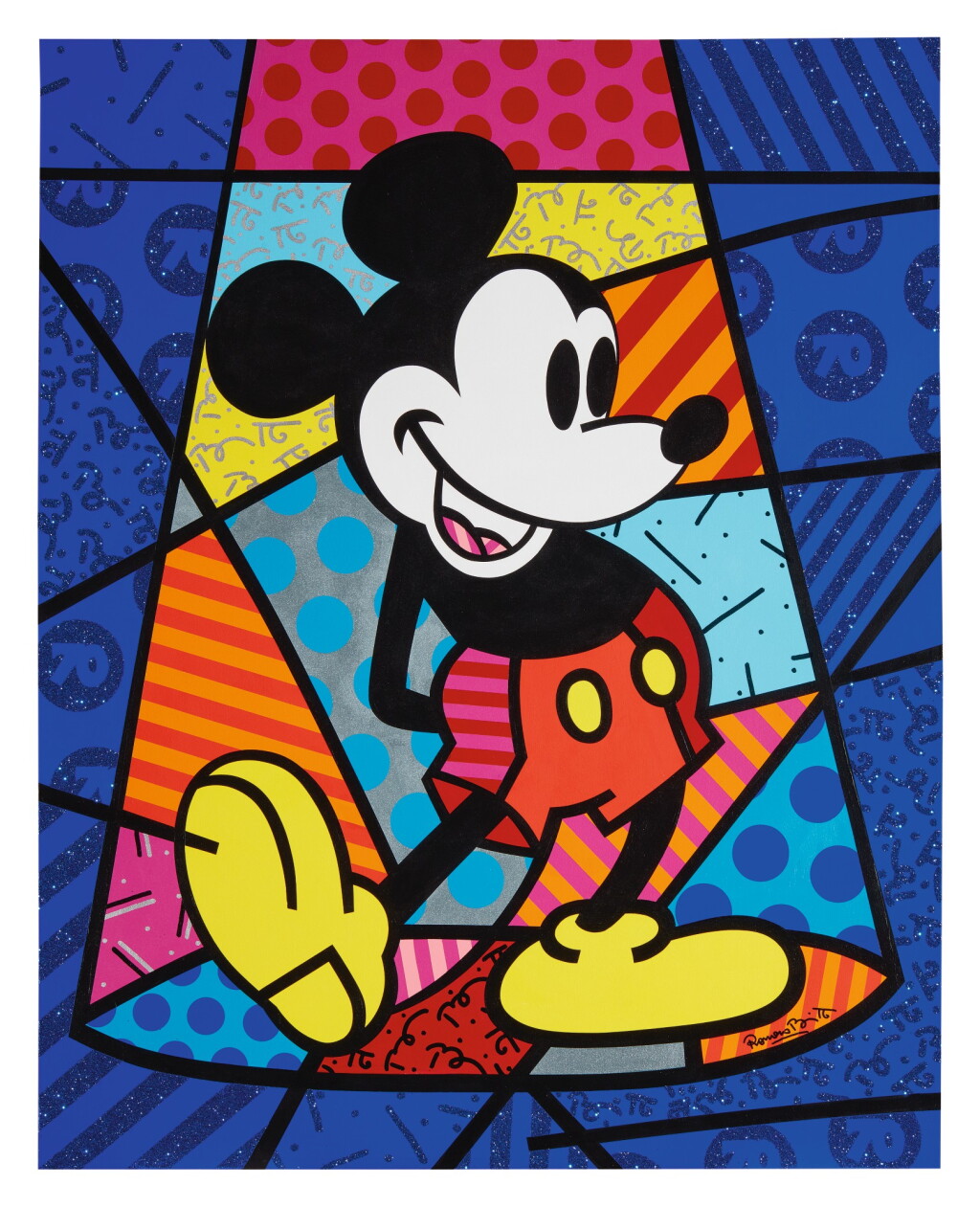
    As to the aesthetic, I took inspiration on the Romero Britto’s artwork, a renowned Brazilian abstract painter, now living in Florida, USA.

    He defines his own artwork as happiness, has an extensive gallery of random subject paints and prices from his canvas can reach up to US$ 2 million for a single painting.

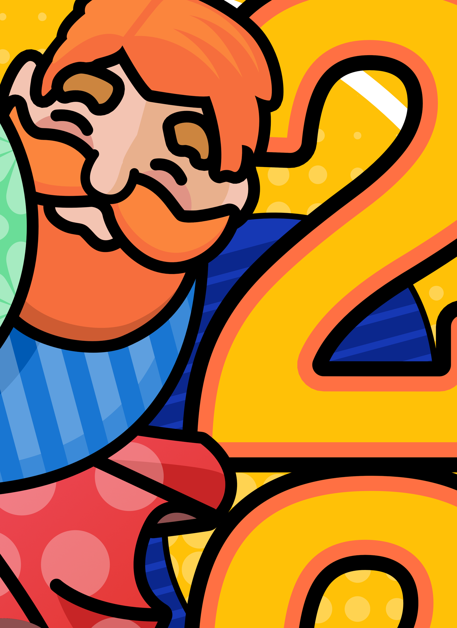
    The vector-like strokes and precise bold lines filled with colorful patterns looks great on digital and printed media, thus, being my first choice to elaborate on the subject.

    Although this being a starting point, our Kreiselfest Brand came out with my own point of view, with quite different line design, weight, clear boundaries, cleaner pattern and a technically controlled color palette.

    The Design Process

    It started with many pencil sketches in my notebook until I found the circle formation with elements inside and typography outside.

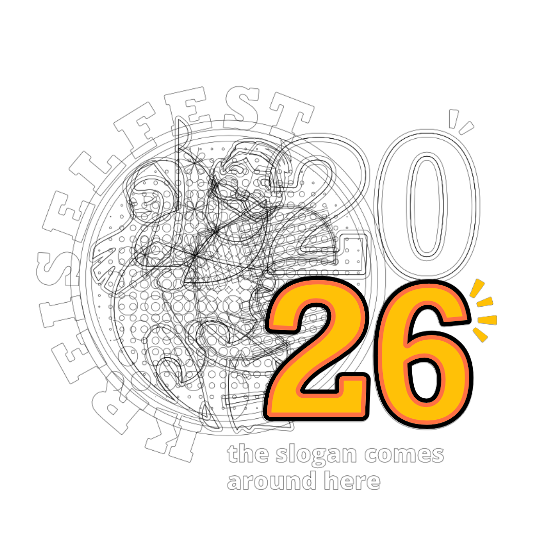
    Once found the core composition, I designed the shapes in vector software and fine-tune all the measurements and adjustments to balance and fit all the elements.

    After that I refined the colors to a limited palette and applied many combination until the most balanced and harmonic was found.

    Kreiselfest behind the scenes
    Behind the scenes: ongoing process with multiple versions

    The final approved version later on included a second logo and a website. The project counts many dedicated worked hours, and it is still ongoing as website evolves. Don’t miss to visit the official Kreiselfest website as well.

    Technically, the logo was a complex puzzle of shapes and patterns, but aesthetically it looked smooth and easy on the eyes.

    Shortly after the logo was done, I got a request to expand the project to a second logo, this time for the side event, the music festival.

    Before diving into the complimentary logo, the next step of the process was to elaborate the brand guidelines and usage, as well as some mock ups with practical examples.

    The logo was also built to be modular and ready to be update next and upcoming years. The way I built it, it is quite easy to change 26 to 27 or whatever the year number that the next festival will be held.

    But I must admit, if I am to be honored again to manage the brand next festival edition, I would change the main character elements as well, so as the years and festivals goes by, we end up having a collection of logos with diverse characters, creating a world of its own.

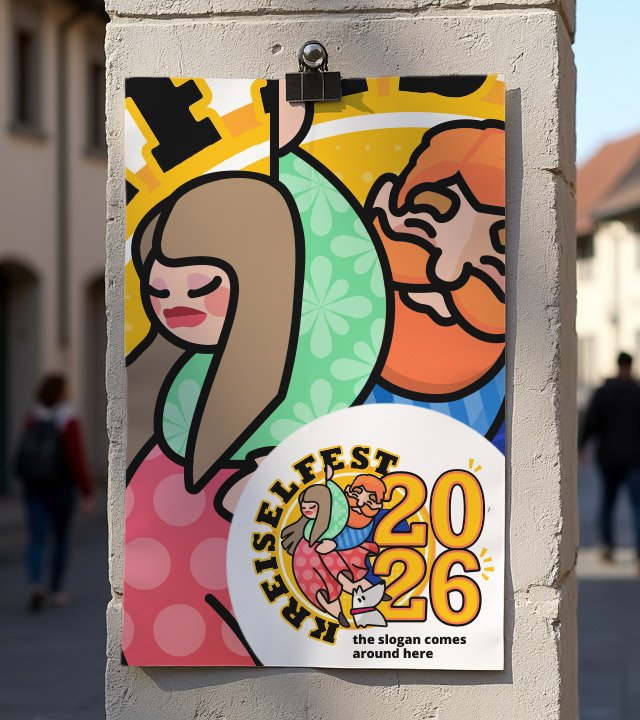
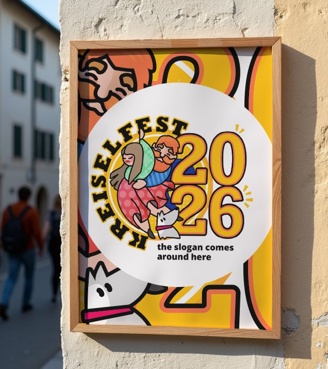
    developing brand collateral based on the brand guidelines

    The circular logo could face complex fitting into the square world of monitors and framing for printed media. The richness of this logo allows us to truly play around and find joyful compositions.

    This was done by isolating the logo in a radial neutral border and filling the background with a mixture of its elements, drawing the eye always to the main element and filling with uplifting vibe all around the composition in a less word and more color approach.

    zolli on stage logo

    The Music Event named Zolli on Stage was later added to the project and asked to be designed as a “twin” logo approach.

    For that I used the existing design system and tweaked the characters to a more explicit sign ( music player, singer, dancer ) and used a rather analog color palette with blue and purple being the main mood contributors as the music event usually tends to happen at night. 

    For me, personally, the great addition is the red and white striped pattern added to one character element, clearly honoring the Swiss flag colors and pattern seen in many historical buildings.

    In the end, the main Kreiselfest logo and the Zolli On Stage logo are a great pair that not only look alike, but complements each other to a greater feeling of the event.

    The Kreiselfest Website

    Since the website would have diverse content contributors, I designed the website using Elementor and WordPress for the ease of use and access. The web project started on the brand guidelines and quickly evolved to a website with many pages.

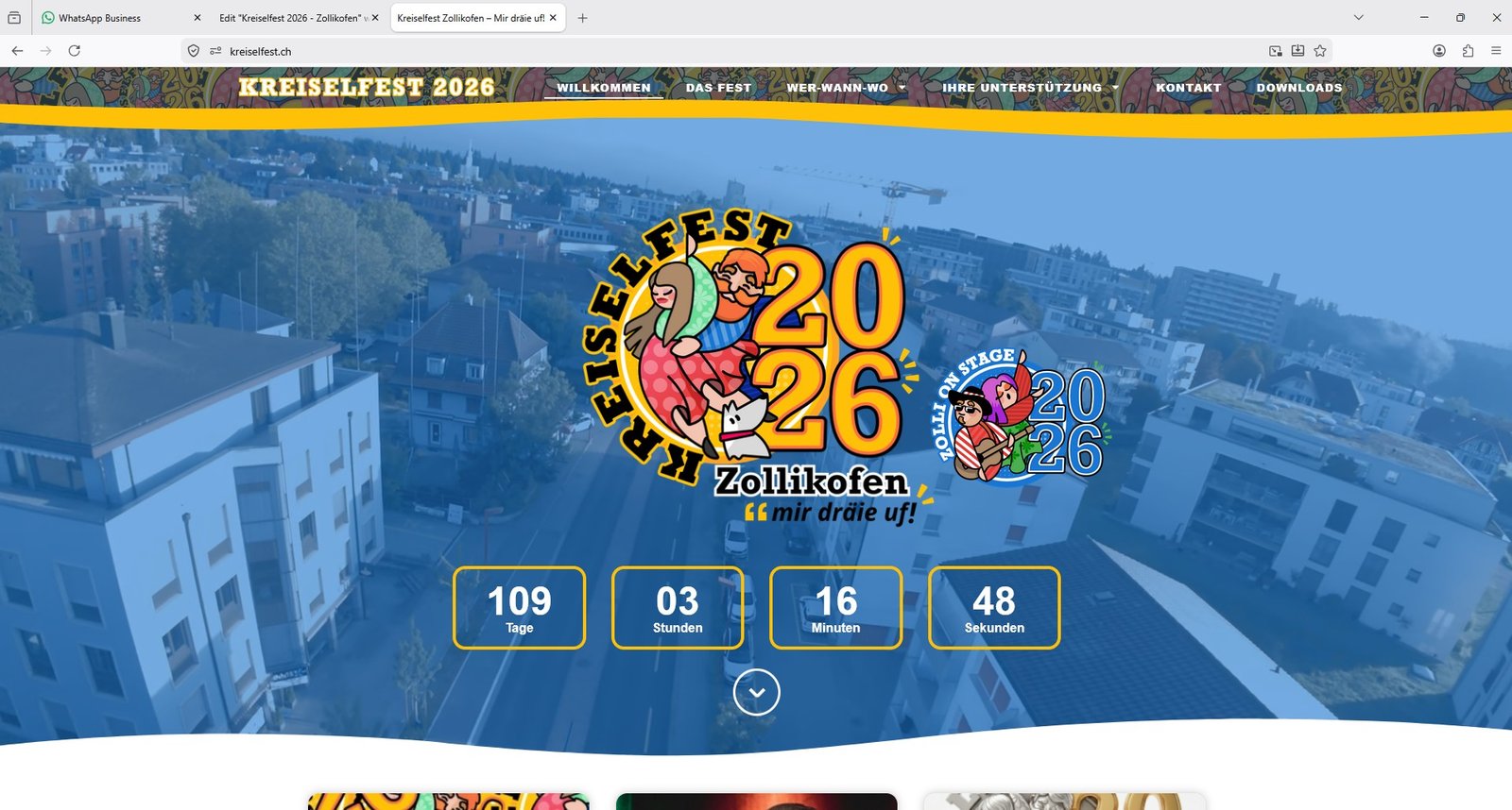
    The key design characteristic is the absence of angular and sharp edges, as the entire project relies on rounded and radial shapes, that also applies to boxes, buttons and sections dividers.

    For the front page I applied a hero banner with a drone-video footage running on the background, showing the overview on where the event will take place. The huge logo is the center piece accompanied by it’s “twin” Music Event logo. Then we have a feature that has a practical role: the live countdown timer, marking the exact time the event will start. Below the fold, we have updated information from the blog.

    CLIENT

    KREISELFEST / ZOLLI ON STAGE (Switzerland)

    PROJECT SCOPE

    BRANDING
    WEBDESIGN

    SOFTWARE

    PHOTOSHOP
    AFFINITY DESIGNER
    WORDPRESS

    My final thoughts on the project

    The project delivers vital information to the public, sells the event to sponsors and will be used as a memory multimedia album after the event. Driving a traffic of thousands of accesses daily, it grew organically with the help of the communication team through an open WhatsApp channel and social media like Instagram.

    This was a rather “different” project, far away from what I am really used to, corporate and serious toned businesses, and I must admit I had fun creating it. To use a more playful color palette and to design characters for a logo, was something I enjoyed and tested my skills at the same time.

    I’d like to thank very much the sponsoring and trust from Intelliworld that not only made it easy for me to understand the project’s needs as well defended the project to the committee board. Huge thanks Scott!

  • Branding Case

    Branding Case

    Selected branding case

    Full corporate identity design, marketing and communication strategy

    This branding case is my most extensive work ever done for a single client.

    It starts with a logo design and new brand guidelines to help shape a new mindset from top-down. It took many months until completion.

    UNICA Corp is a company located in São Paulo / Brazil that outsources facilities services such as cleaning, security, gardening, parking, building maintenance, and catering for over 120 clients nationwide.

    The company had 3,000 employees and the initial goal was to double the size of the company and triple revenue in 4 years. The ultimate goal was to make it attractive enough for purchase or fusion by other larger companies, which was achieved after 10 years of restructuring and assertive work in all departments, including marketing which I was responsible for 6 years.

    Starting point

    The original logotype was bland and had a futuristic typeface. It also did not resemble all the services provided by the company.

    original logo from 2014

    We need an identity that shows the variety of our services, yet organized. It should also show us as a safe and solid company people can trust. We have a more horizontal corporate hierarchy and our services should be seen as integrated, yet modular.

    First Rebrand

    This was the first rebrand in 2016

    I designed the new logo using 3 squared icon filled with flat colors to organize all the services into 3 main areas: facilities, security and food.

    The new typeface resembles the original one but is steadier, provides a  and provides better legibility.

    The form is ultra-wide analog to horizontal hierarchy and also to the extend of services offered.

    As brand manager, I created a new slogan that sells value. It reads “We work to delight.” This was a surprise to all employees and clients, and soon beagn to be part of everybody´s daily lives.

    Icon used on the company´s app

    Company fassade in the early stages of rebranding

    Fleet of operational vehicles

    I also designed logotypes for the services offered for external and internal targets such as clients and employees.

    And after a year all the company was already living the new mindset nurtured by the outlined new brand.

    Uniform design

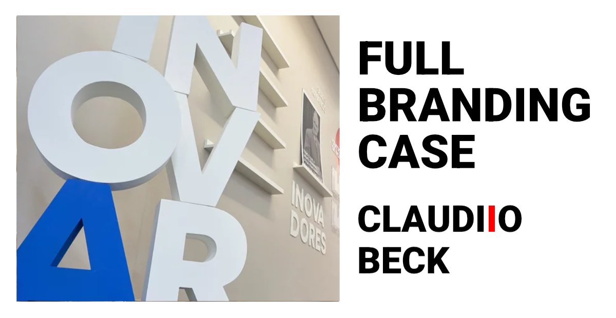
    Innovation room was designed to collect new ideas from employees and clients

    Interior design kept the branding guidance I designed

    During this period of time, even with low investment in marketing and almost no team to give support, I managed to design more than a hundred different assets for specific clients and specific branches. This included video content which you will find at the end of this page.

    Nevertheless, I designed the brand-specific roles keeping the essence but flexing to cover fragile spots as long as the board of directors kept correcting the business direction.

    Service design to to value company´s portfolio

    Each room was designed for a purpose

    Claudio Beck palestrante UNICA Corp

    Meetings and cross-departamental colaboration

    Smart totens designed to receive feedback were connected in all clients

    Fleet variations were designed to specific roles

    Original photo sessions for designing institutional booklets

    We also participated in events

    Seasonal and themed campaigns events included strategy, event branding, communication and implementation.

    Second Rebrand

    We love the logo, colors are meaningful for us and the slogan is an absolute killer. Our business is more profitable when selling security services and, now on, we want to focus on that.

    Rebrand our company keeping our colors but focus on security and, above all, it should resemble the looks of Google´s so people see us as an innovative company as well.

    After 3 years and with the guidance of a strategy consulting partner, the company found out that other services than security would not leave great profit margins, therefore, we had to re-design the company identity to position itself as a security outsourcing provider, yet, keeping the DNA that was already a success.

    Don´t forget. It should resemble Google. It should resemble security. It should keep our colors.

    Google´s brand identity in 2019

    The shield was designed approved as icon

    Company name now has two levels but kept the same typeface

    Color palette variation for monochromatic applications

    Positive / Negative

    Color palette

    Blueprint

    Primary / Alternate

    Block proportion

    Shape build history

    3d project for main office facade

    I designed the new logo following the client´s vision in a smart way to convey all the values the company, now, has to offer.

    It features a much clearer service statement and is very flexible to fit a variety of situations.

    The company gained a complete new arsenal of technology introduced in its Compliance, which became an indissoluble part of its brand.

    For this, new communication assets were unfolded and designed in order to make the new brand noticed in the market. That included a whole new Social Media strategy and visual appeal, presentations, printed booklets, office interior design, stationary, virtual business cards, redesign for the entire vehicle, drones and electric bikes fleet as well as uniforms and a critical website update.

    Compliance redesign

    New CUBO room is filled with hi-tech hardwares and softwares.

    A set of teaser videos showcasing news were filmed and edited by me

    Another set of videos shows operational vehicles in action

    Leadership Programme flyer design

    Design template for Social Media

    Security vehicles fleet design

    Special vehicle brings education to employees nation-wide

    Printed ads for indoor use

    Innovation room revamped with a new portfolio of electric vehicles.

    Security division got vehicle fleet and uniform design updates

    It would take more pages of content to present the many other materials that were designed over the 6 years that I was at the head of the company’s communication and marketing department, acting mainly as brand manager and advising on internal and external communication in all points of contact with target audiences.

    Below you will find a compilation of video teasers, mostly operational training, which were used as promotional material without the traditional characteristics of advertising.

    During COVID pandemic crysis, the aid of biometric tech was a life saver

    Other projects worth a look

    Branding and corporate visual identity for private companies focused on B2B branch.

    Thanks for watching!

    ━
    Connect with me on LinkedIn: www.linkedin.com/in/claudiobeck

  • Sativa Vet Package Design

    Package Design

    paketdesign / conception de l’emballage /design de embalagem

    An excellent package design should be visually appealing, functional, easy to use and communicate key information to the consumer.

    This can be achieved through the use of design elements such as color theory, typography, and hierarchy of information. Additionally, it should use appropriate design elements, materials, be user-friendly, sustainable and comply with industry regulations and standards.

    This package design for the pharmaceutical product based on CBD hemp oil was created with the objective of making it easy for veterinarians to find the right medication at a glance on the shelves. One of the key elements of the design is the use of large percentage numbers, which are prominently displayed on the front of the package. This allows veterinarians and pharmacists to quickly and easily identify the concentration of CBD in the product, making it easier to choose the right medication for their pet patients.

    The design also features bold, eye-catching colors and a clean, modern aesthetic that is sure to stand out on store shelves. The use of high-quality materials and a sturdy construction ensures that the package will hold up well over time, even in busy veterinary clinics and pharmacies.

    Overall, the package design for this CBD hemp oil product is both functional and visually appealing, making it an easy-to-recognize medication.

    ━
    ✉️ Project inquiries: comission@claudiobeck.com

    Thanks for watching!

    ━
    ✉️ Email me for project comissions: comission@claudiobeck.com
    🤝 Connect with me on LinkedIn: www.linkedin.com/in/claudiobeck

    Check other projects

plugins premium WordPress