Selected branding case
Full corporate identity design, marketing and communication strategy
This branding case is my most extensive work ever done for a single client.
It starts with a logo design and new brand guidelines to help shape a new mindset from top-down. It took many months until completion.
UNICA Corp is a company located in São Paulo / Brazil that outsources facilities services such as cleaning, security, gardening, parking, building maintenance, and catering for over 120 clients nationwide.
The company had 3,000 employees and the initial goal was to double the size of the company and triple revenue in 4 years. The ultimate goal was to make it attractive enough for purchase or fusion by other larger companies, which was achieved after 10 years of restructuring and assertive work in all departments, including marketing which I was responsible for 6 years.
The original logotype was bland and had a futuristic typeface. It also did not resemble all the services provided by the company.

original logo from 2014
We need an identity that shows the variety of our services, yet organized. It should also show us as a safe and solid company people can trust. We have a more horizontal corporate hierarchy and our services should be seen as integrated, yet modular.
original briefing

This was the first rebrand in 2016
I designed the new logo using 3 squared icon filled with flat colors to organize all the services into 3 main areas: facilities, security and food.
The new typeface resembles the original one but is steadier, provides a and provides better legibility.
The form is ultra-wide analog to horizontal hierarchy and also to the extend of services offered.
As brand manager, I created a new slogan that sells value. It reads “We work to delight.” This was a surprise to all employees and clients, and soon beagn to be part of everybody´s daily lives.
Icon used on the company´s app
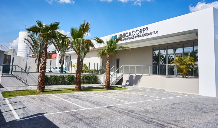
Company fassade in the early stages of rebranding
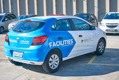
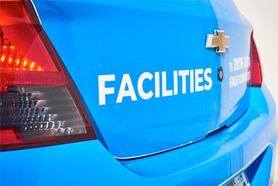

Fleet of operational vehicles
I also designed logotypes for the services offered for external and internal targets such as clients and employees.


And after a year all the company was already living the new mindset nurtured by the outlined new brand.
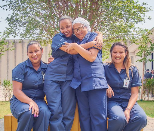
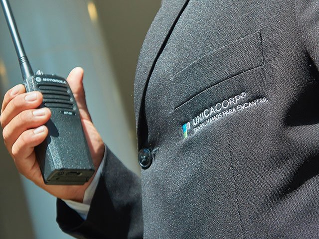
Uniform design
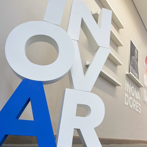
Innovation room was designed to collect new ideas from employees and clients
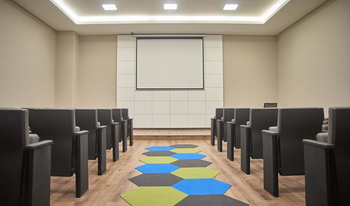
Interior design kept the branding guidance I designed
During this period of time, even with low investment in marketing and almost no team to give support, I managed to design more than a hundred different assets for specific clients and specific branches. This included video content which you will find at the end of this page.
Nevertheless, I designed the brand-specific roles keeping the essence but flexing to cover fragile spots as long as the board of directors kept correcting the business direction.
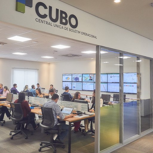
Service design to to value company´s portfolio

Each room was designed for a purpose
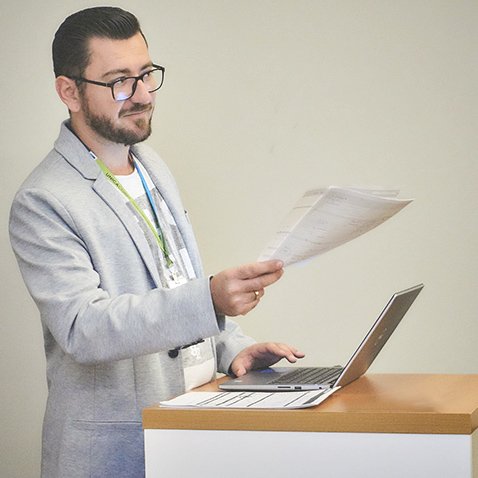
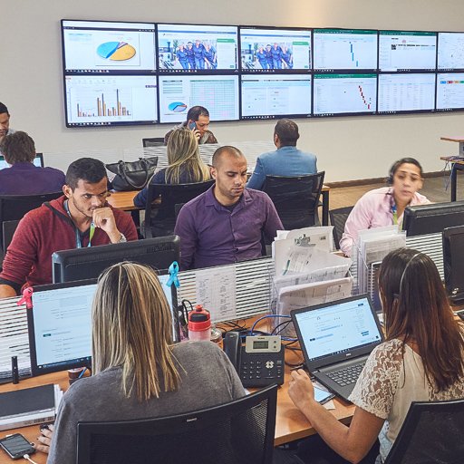
Meetings and cross-departamental colaboration
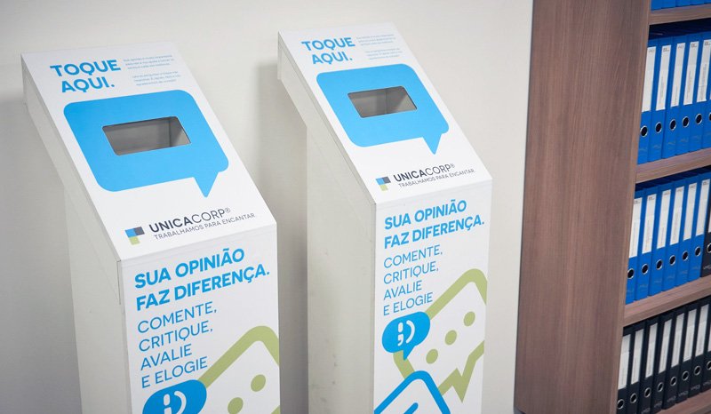
Smart totens designed to receive feedback were connected in all clients
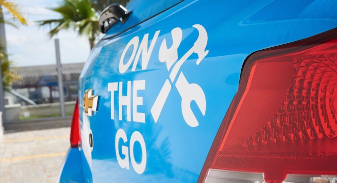
Fleet variations were designed to specific roles
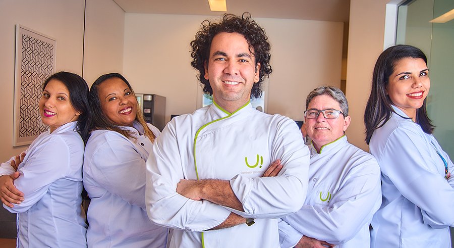
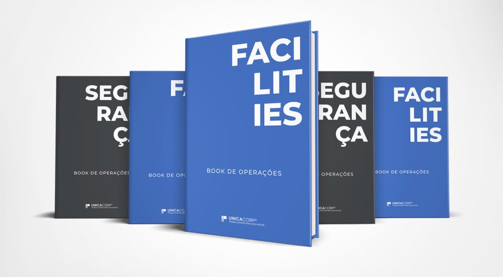
Original photo sessions for designing institutional booklets
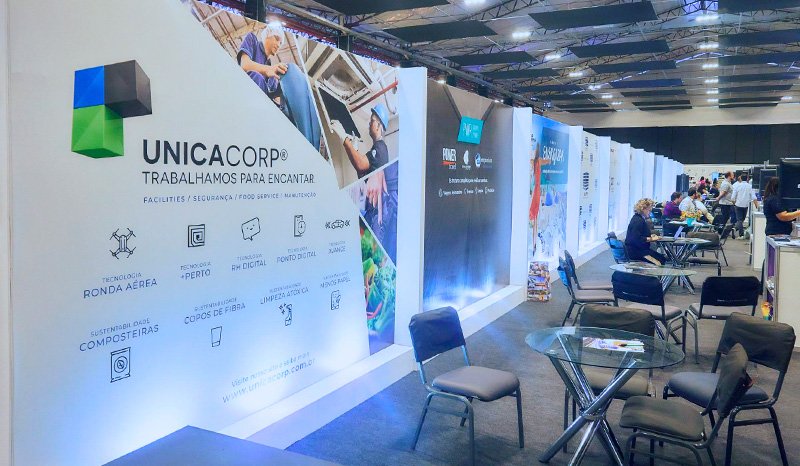
We also participated in events
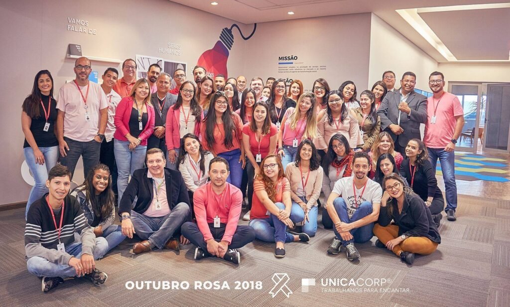
Seasonal and themed campaigns events included strategy, event branding, communication and implementation.
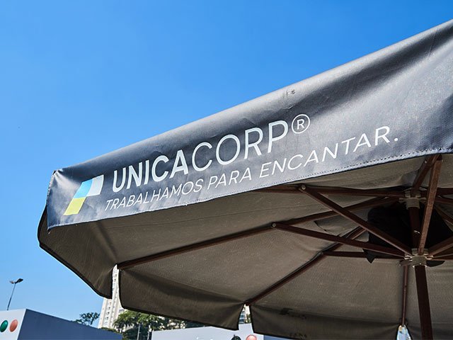
We love the logo, colors are meaningful for us and the slogan is an absolute killer. Our business is more profitable when selling security services and, now on, we want to focus on that.
Rebrand our company keeping our colors but focus on security and, above all, it should resemble the looks of Google´s so people see us as an innovative company as well.stated the briefing
After 3 years and with the guidance of a strategy consulting partner, the company found out that other services than security would not leave great profit margins, therefore, we had to re-design the company identity to position itself as a security outsourcing provider, yet, keeping the DNA that was already a success.
Don´t forget. It should resemble Google. It should resemble security. It should keep our colors.
reminded me the CEO


Google´s brand identity in 2019

The shield was designed approved as icon
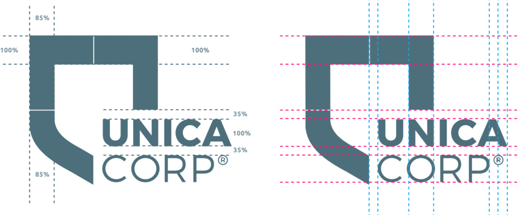
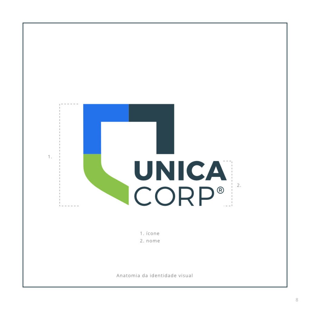
Company name now has two levels but kept the same typeface

Color palette variation for monochromatic applications
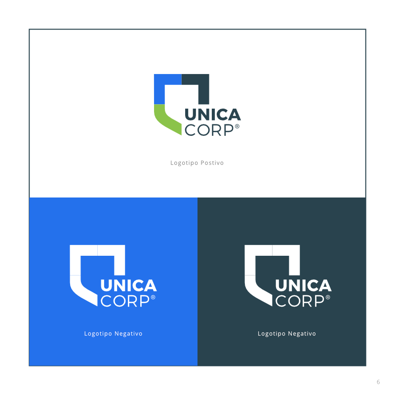
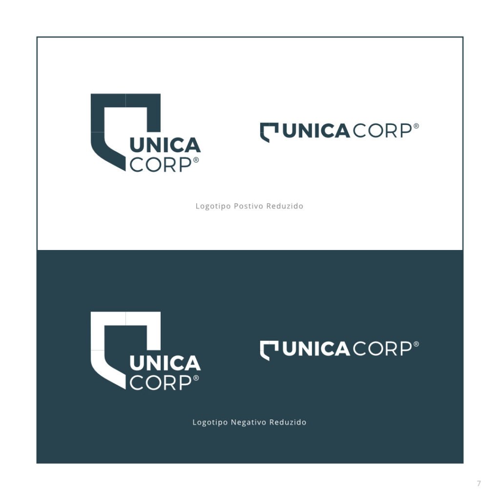
Positive / Negative
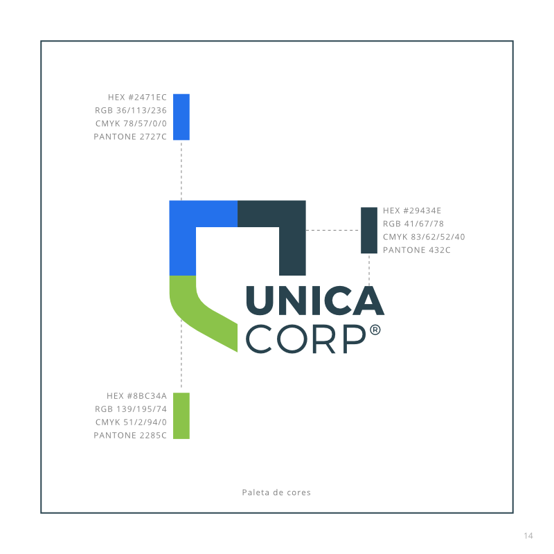
Color palette
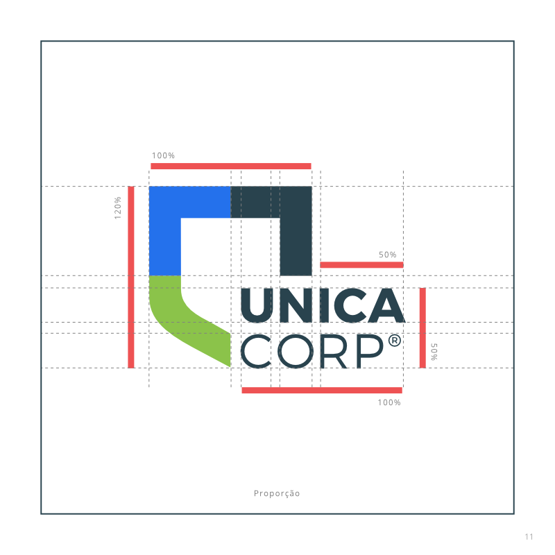
Blueprint
Primary / Alternate
Block proportion
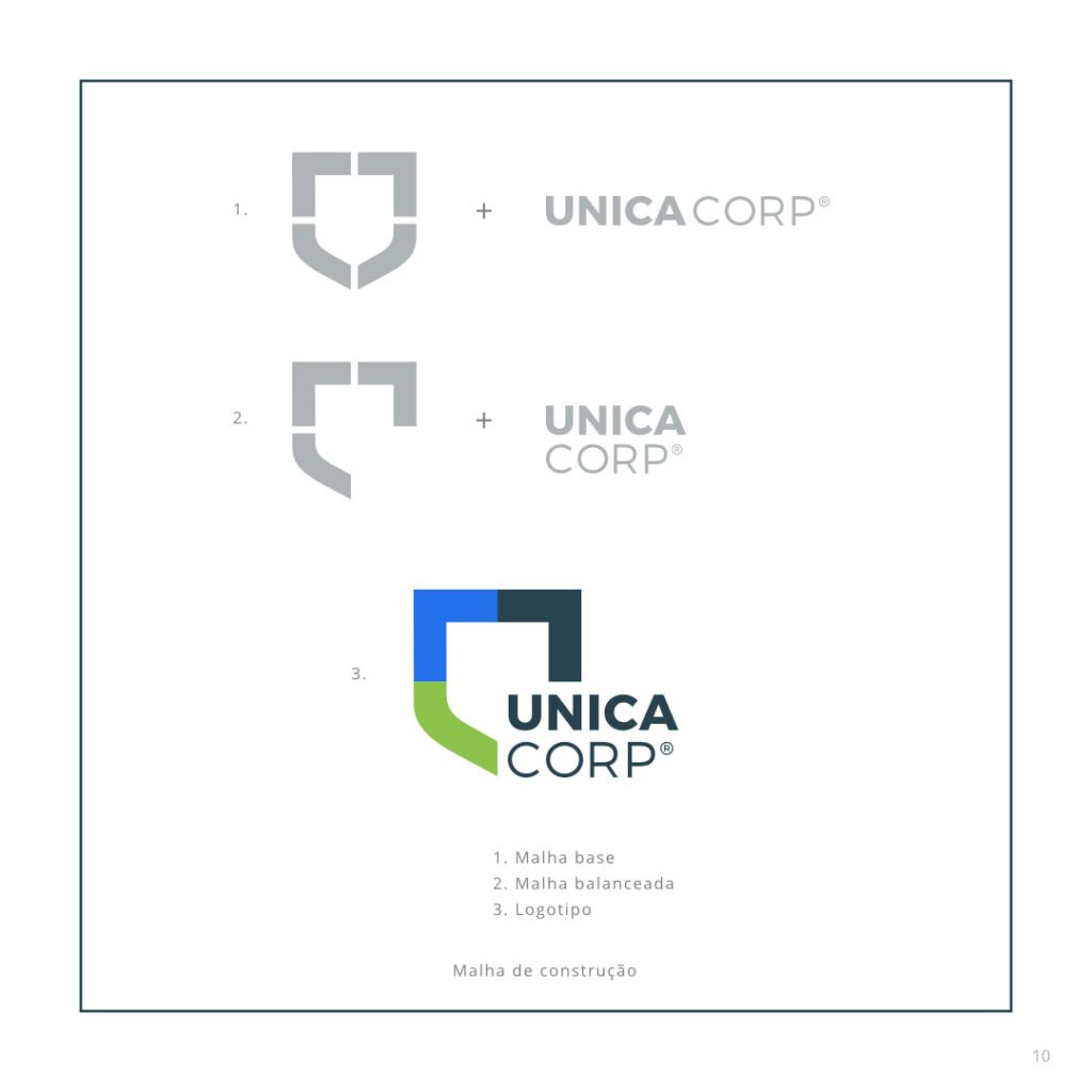
Shape build history

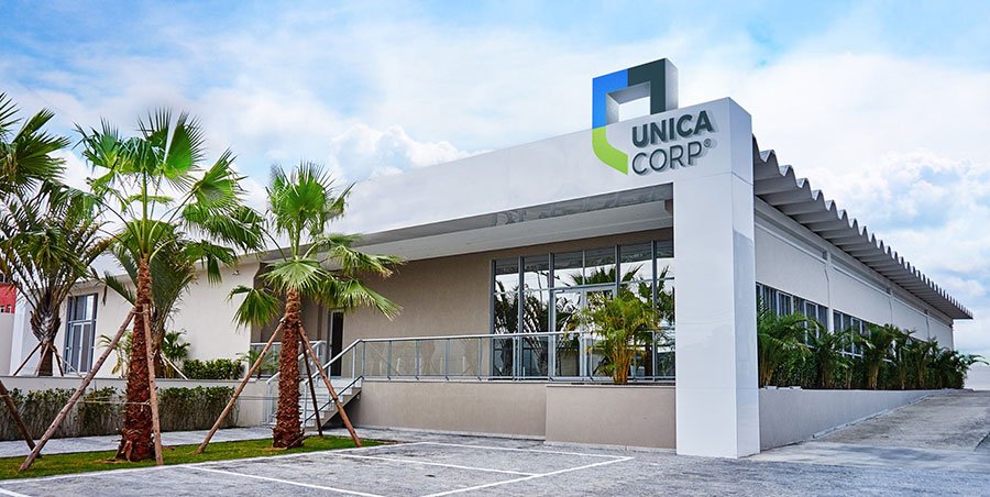
3d project for main office facade
I designed the new logo following the client´s vision in a smart way to convey all the values the company, now, has to offer.
It features a much clearer service statement and is very flexible to fit a variety of situations.
The company gained a complete new arsenal of technology introduced in its Compliance, which became an indissoluble part of its brand.
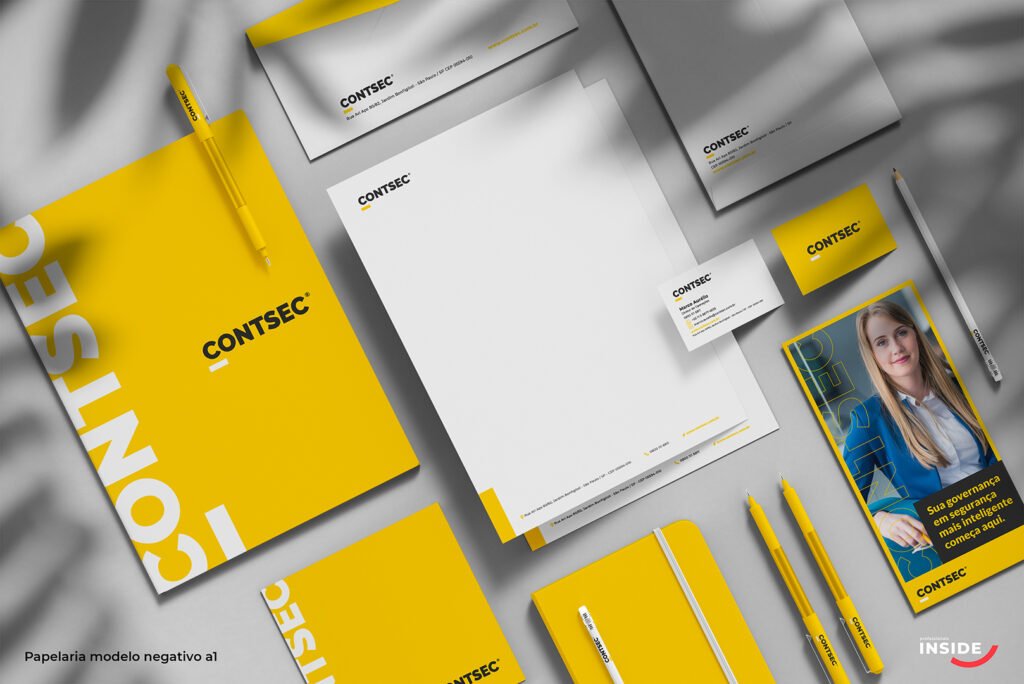
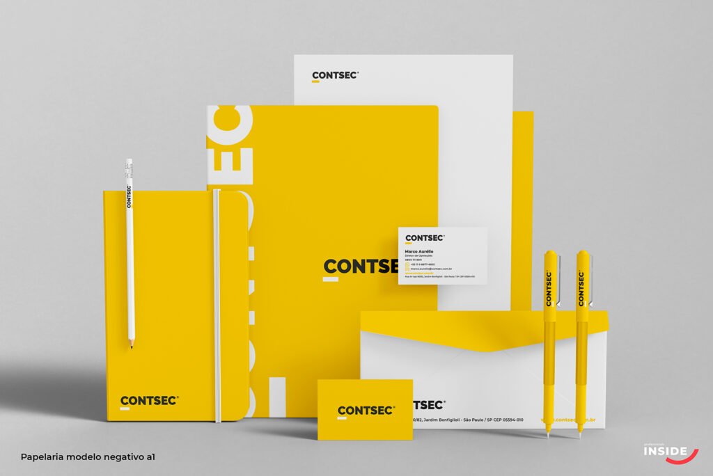
For this, new communication assets were unfolded and designed in order to make the new brand noticed in the market. That included a whole new Social Media strategy and visual appeal, presentations, printed booklets, office interior design, stationary, virtual business cards, redesign for the entire vehicle, drones and electric bikes fleet as well as uniforms and a critical website update.
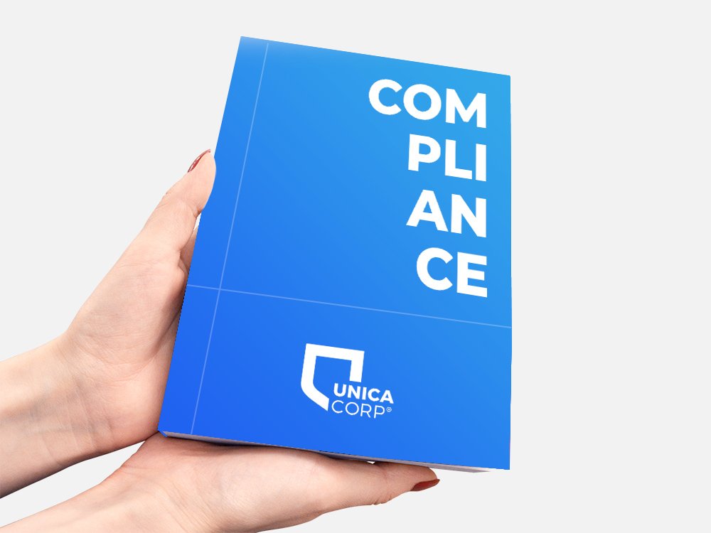
Compliance redesign
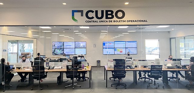
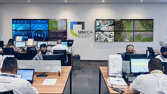
New CUBO room is filled with hi-tech hardwares and softwares.
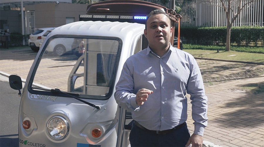
A set of teaser videos showcasing news were filmed and edited by me
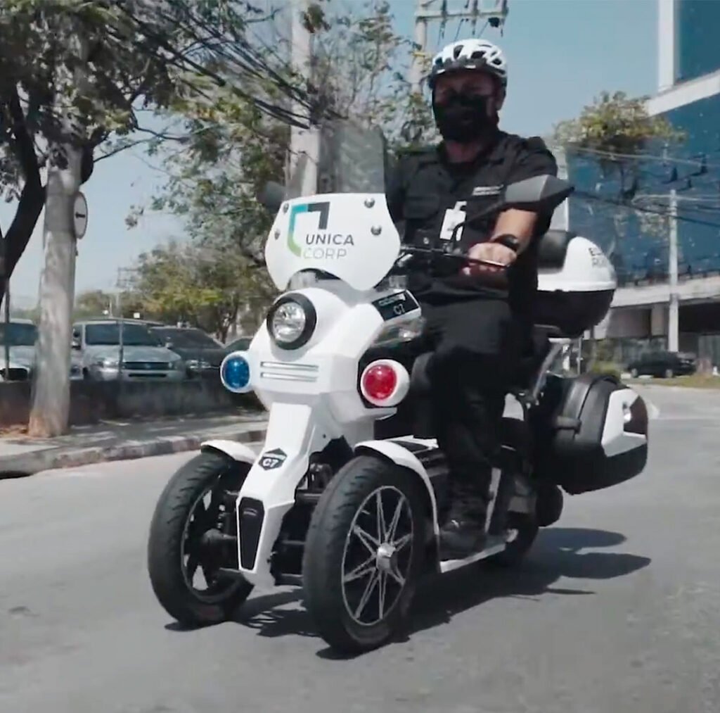
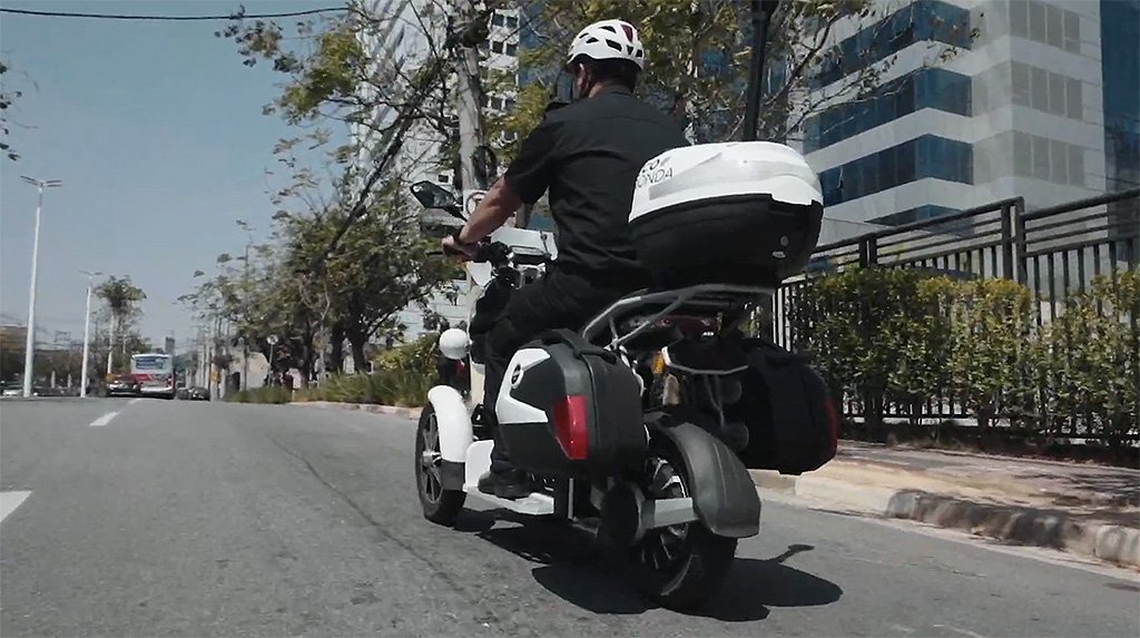
Another set of videos shows operational vehicles in action
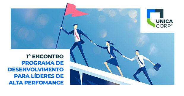
Leadership Programme flyer design

Design template for Social Media
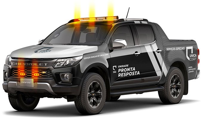
Security vehicles fleet design
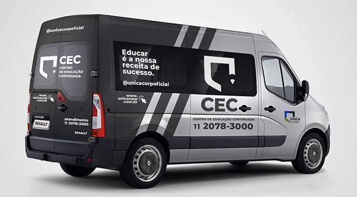
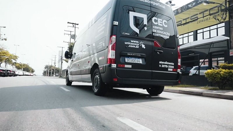
Special vehicle brings education to employees nation-wide
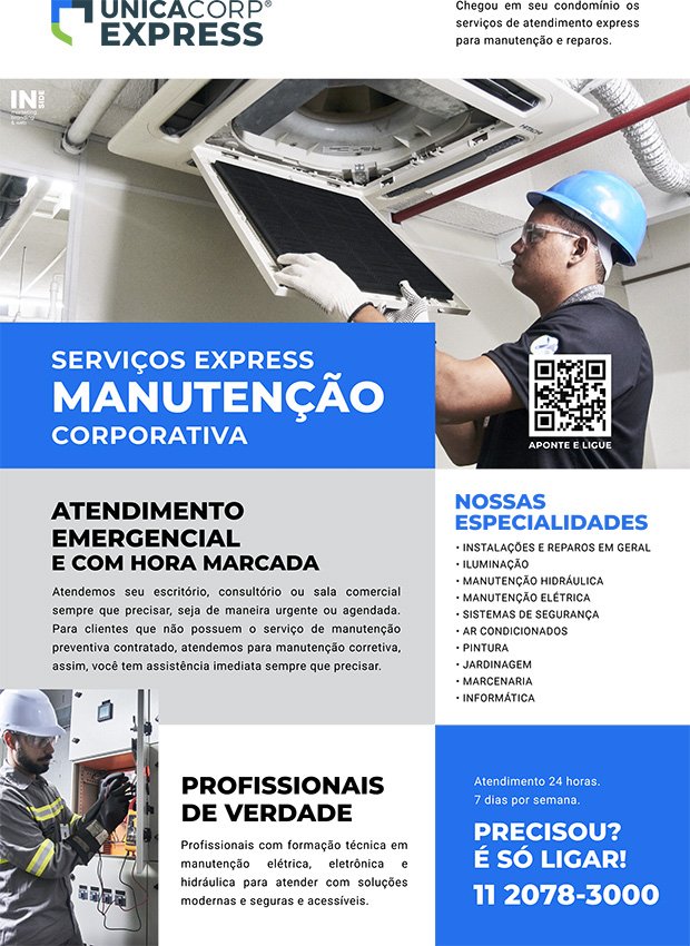
Printed ads for indoor use
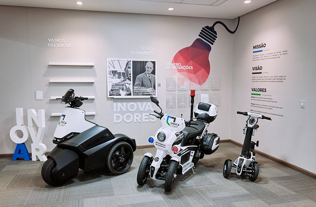
Innovation room revamped with a new portfolio of electric vehicles.

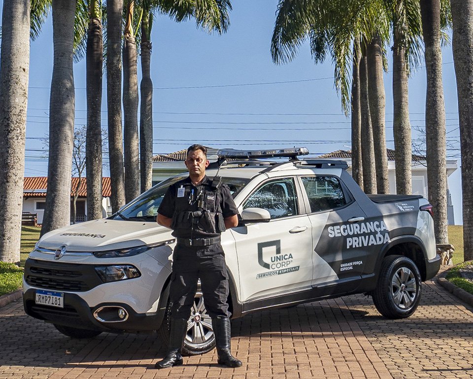
Security division got vehicle fleet and uniform design updates
It would take more pages of content to present the many other materials that were designed over the 6 years that I was at the head of the company’s communication and marketing department, acting mainly as brand manager and advising on internal and external communication in all points of contact with target audiences.
Below you will find a compilation of video teasers, mostly operational training, which were used as promotional material without the traditional characteristics of advertising.
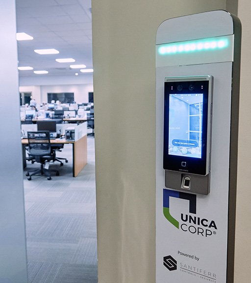
During COVID pandemic crysis, the aid of biometric tech was a life saver
━
Connect with me on LinkedIn: www.linkedin.com/in/claudiobeck
One Response